
The Auralen Rebrand: Clarity as Craft
Some rebrands are about going bigger. More color. More voice. More energy. But sometimes, the most meaningful shift comes from pulling things back.
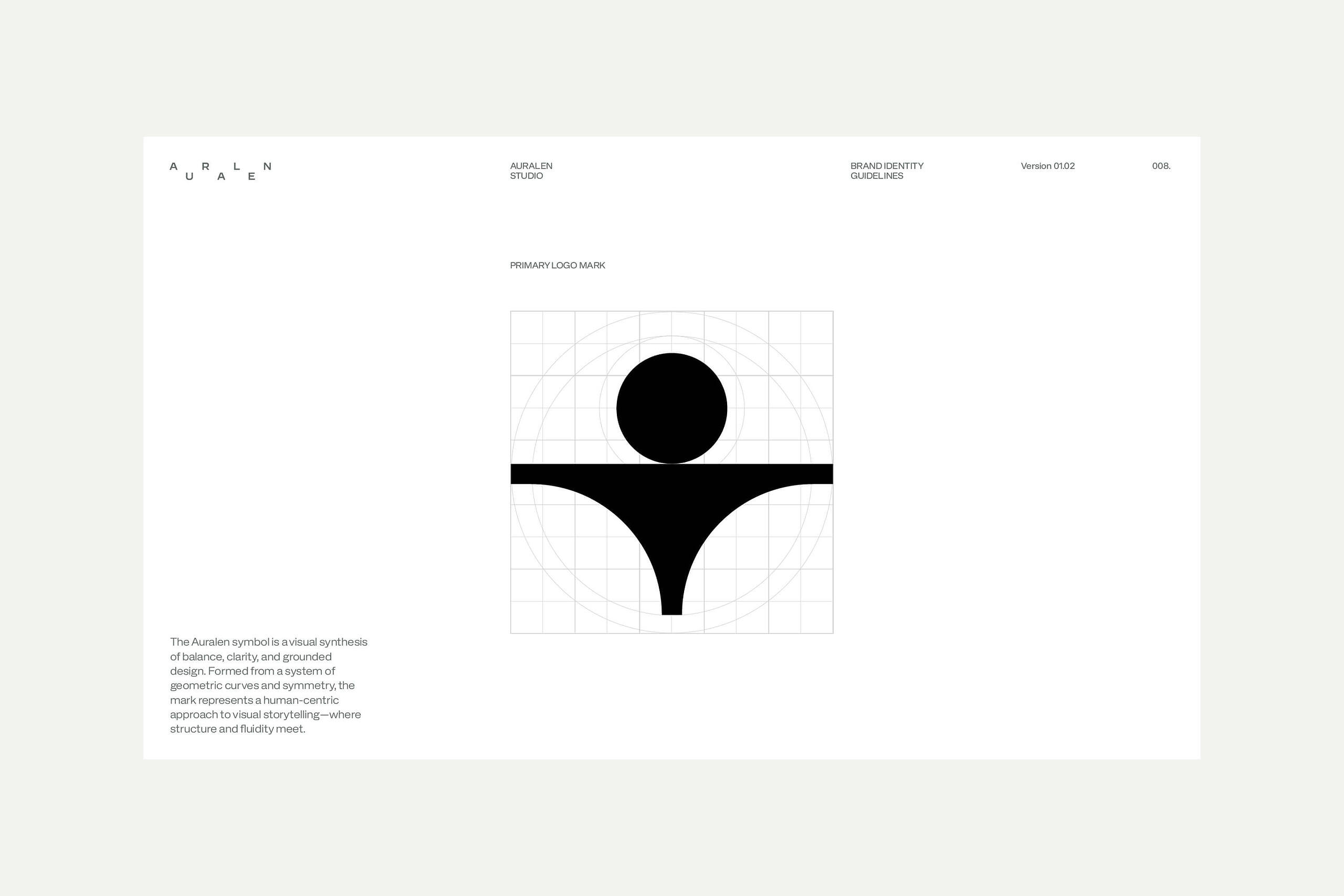
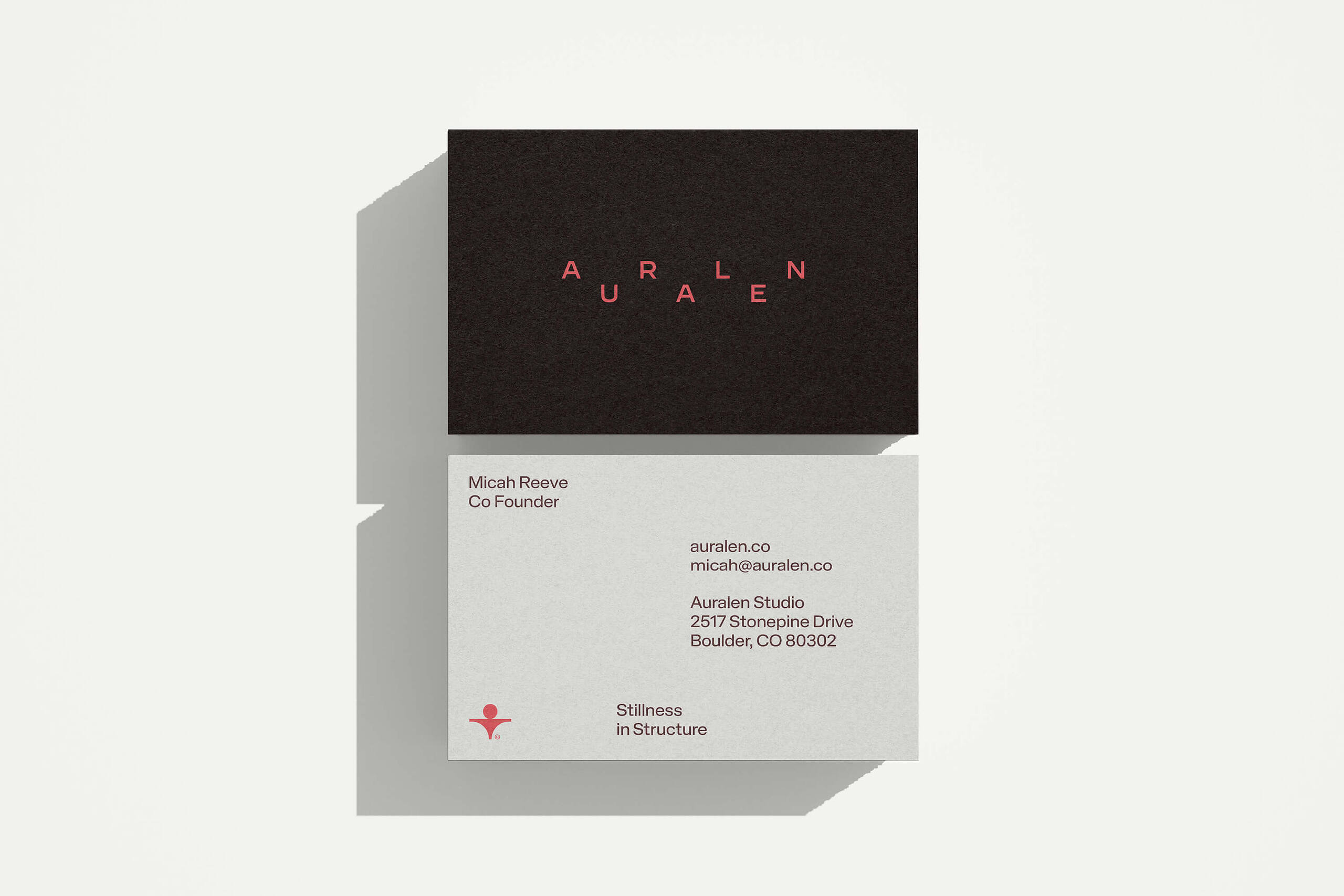
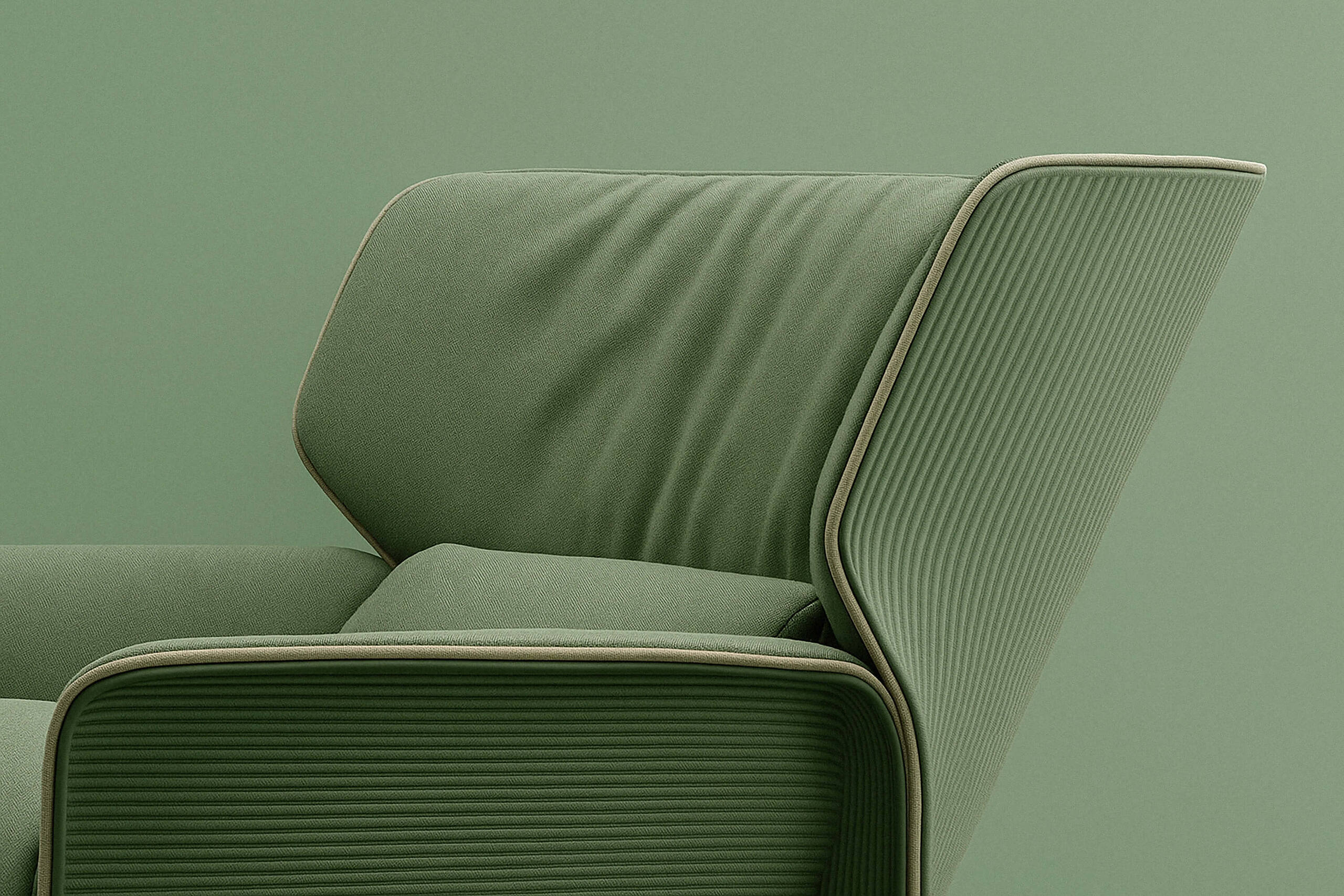
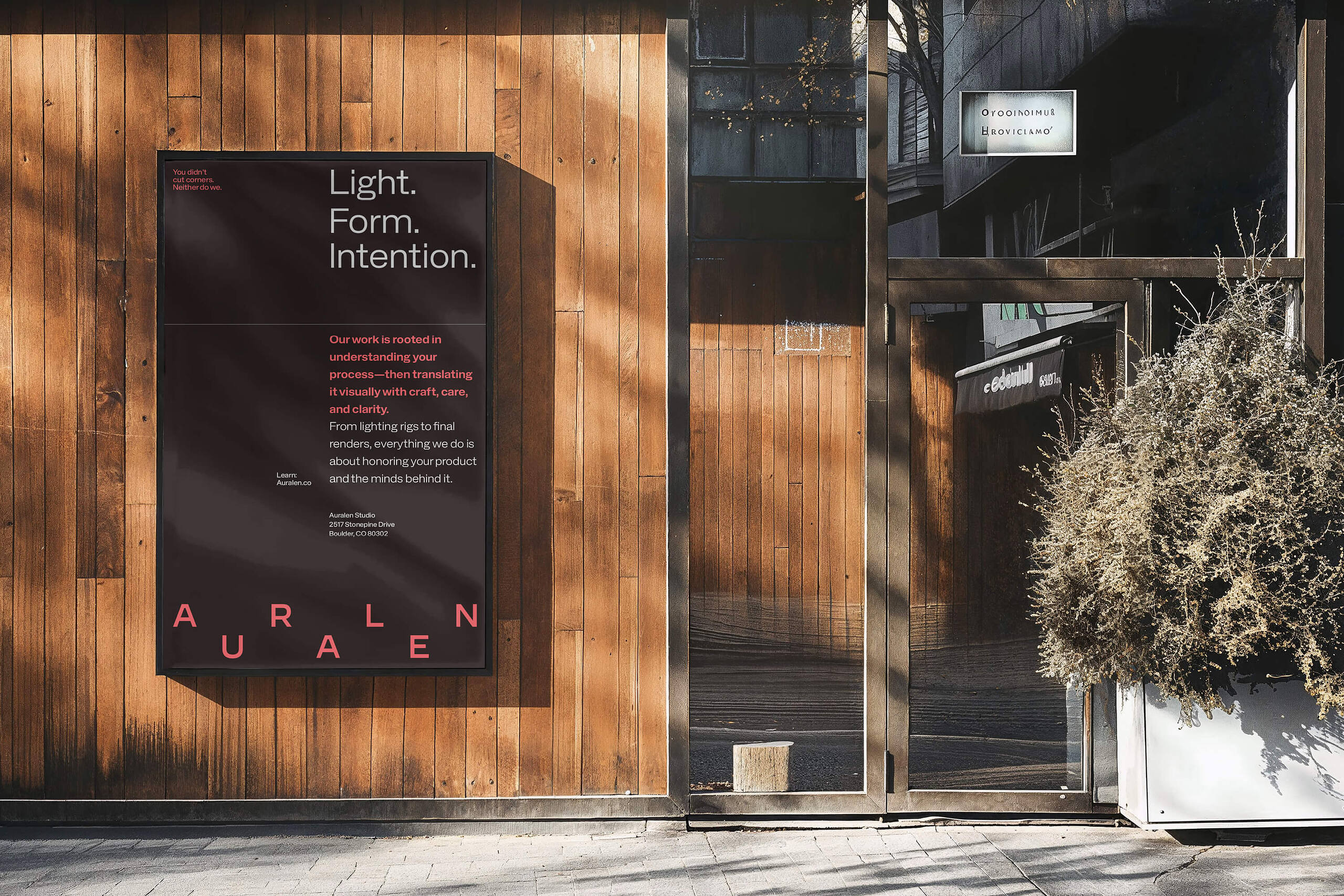
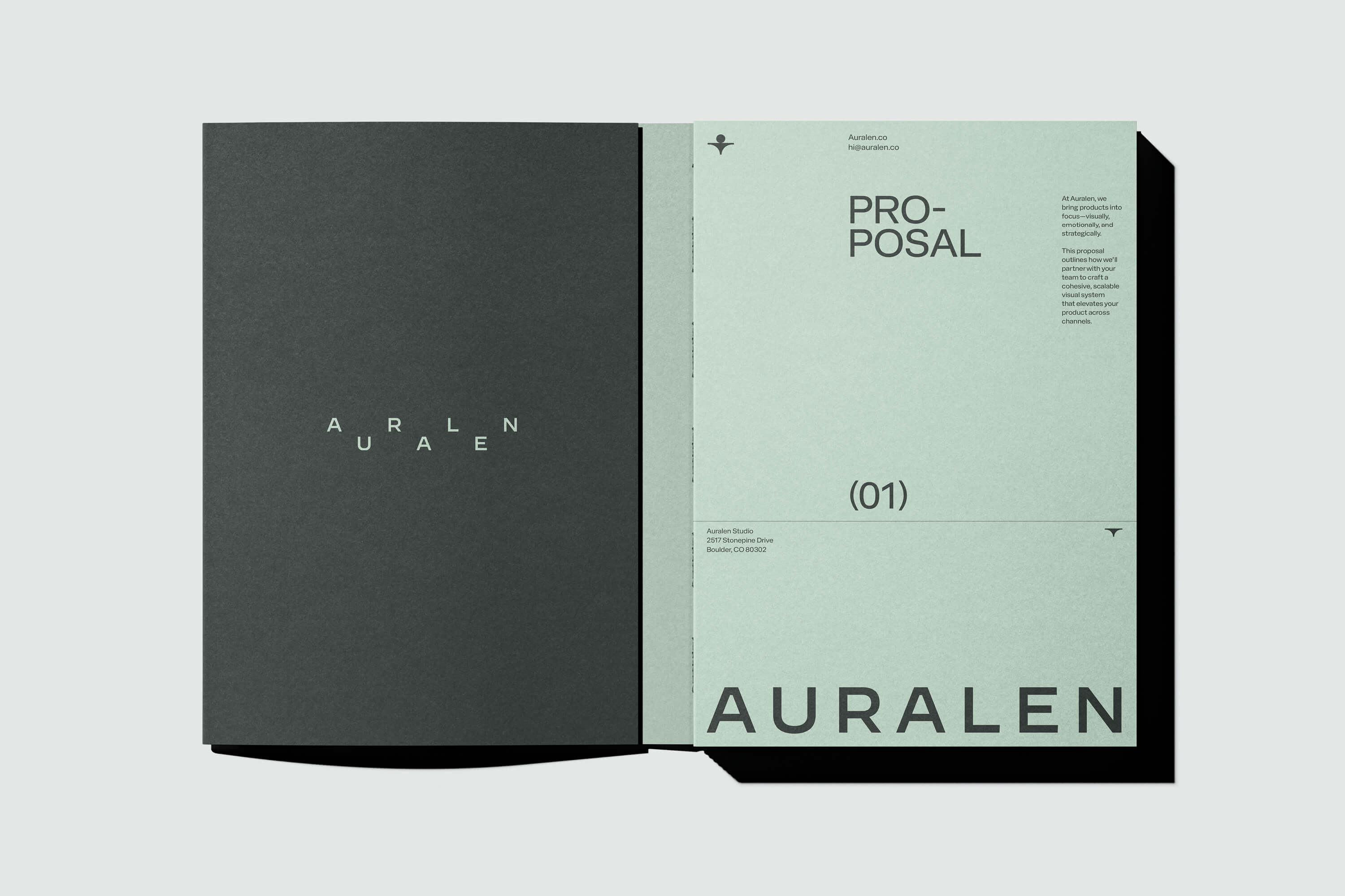
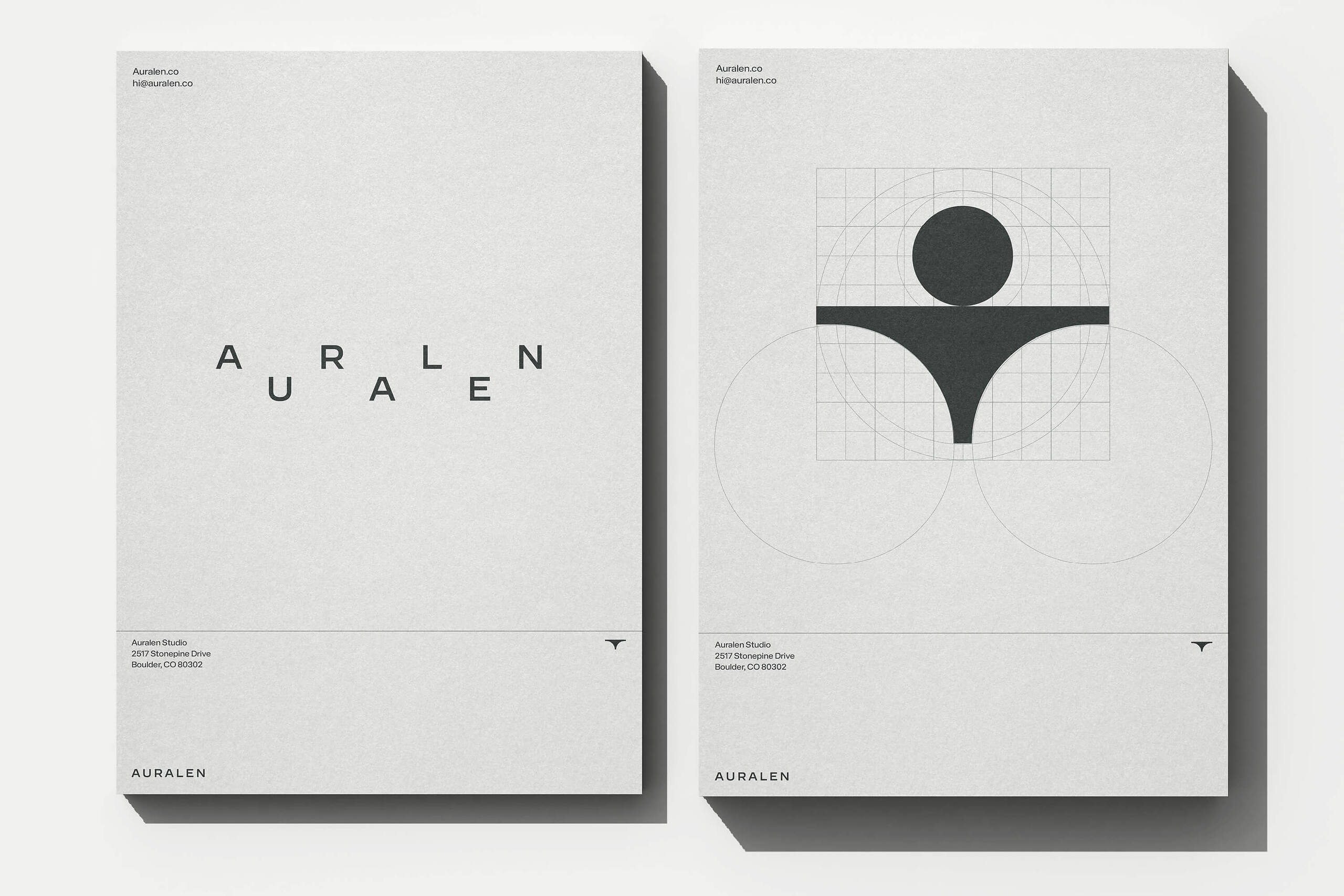
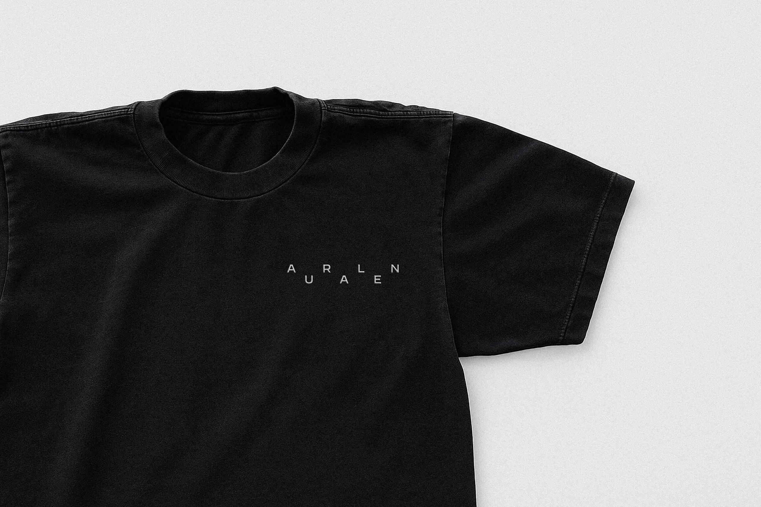
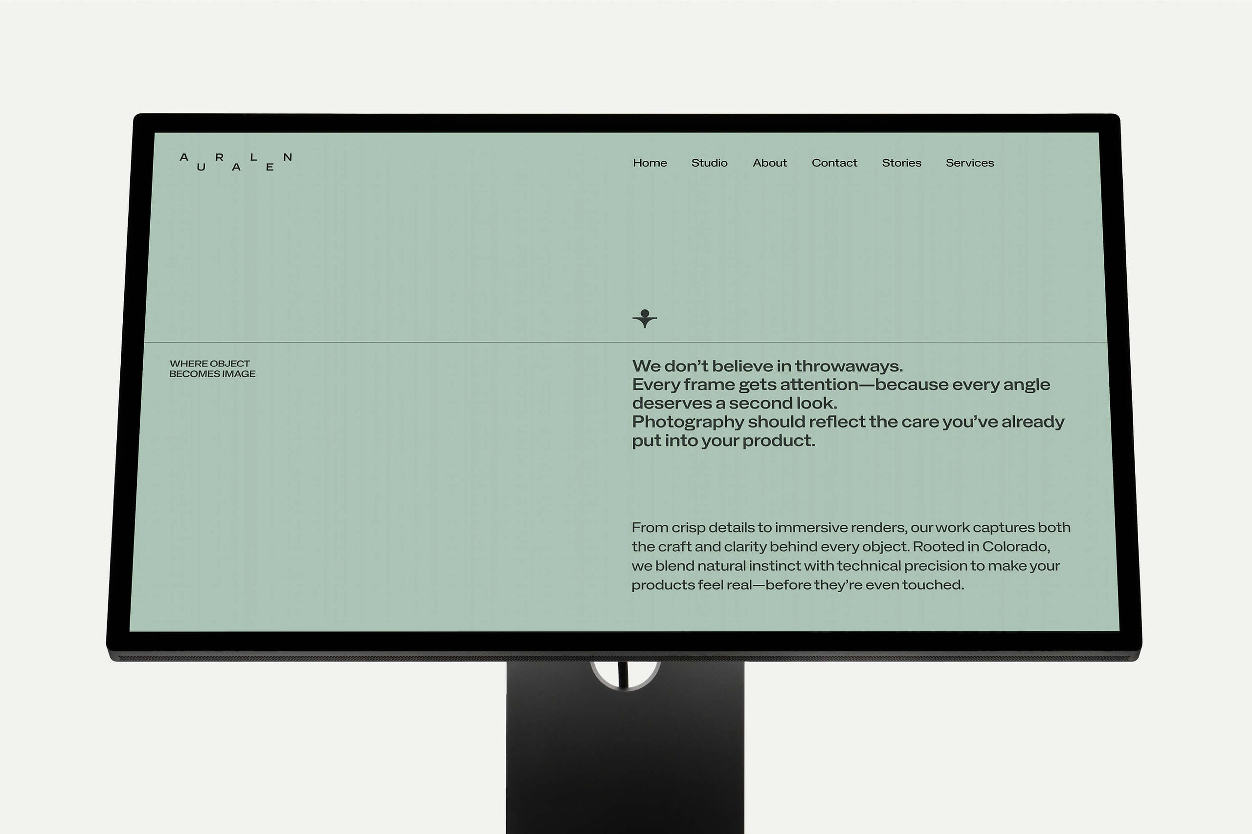
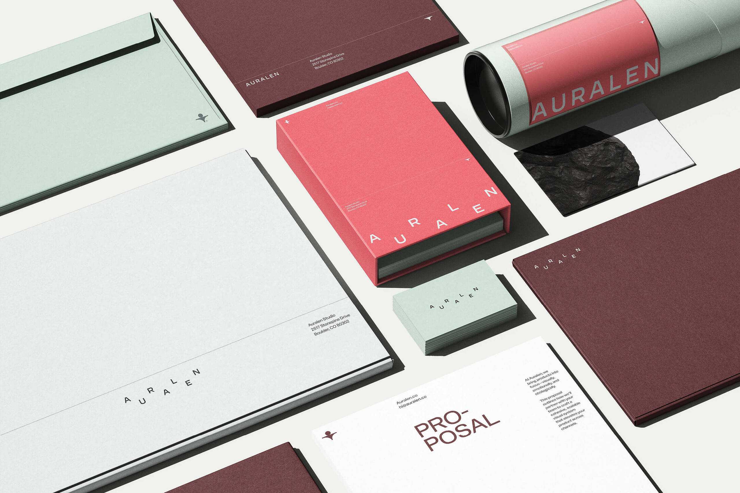
Auralen is a Colorado-based studio specializing in product photography and 3D visualization. Their work is grounded in precision—every shadow, texture, and surface is intentional. Nothing flashy. Everything thoughtful. So when it came to branding, we knew this couldn’t be about making a louder impression. It had to feel like them: steady, sharp, and stripped back to only what matters.
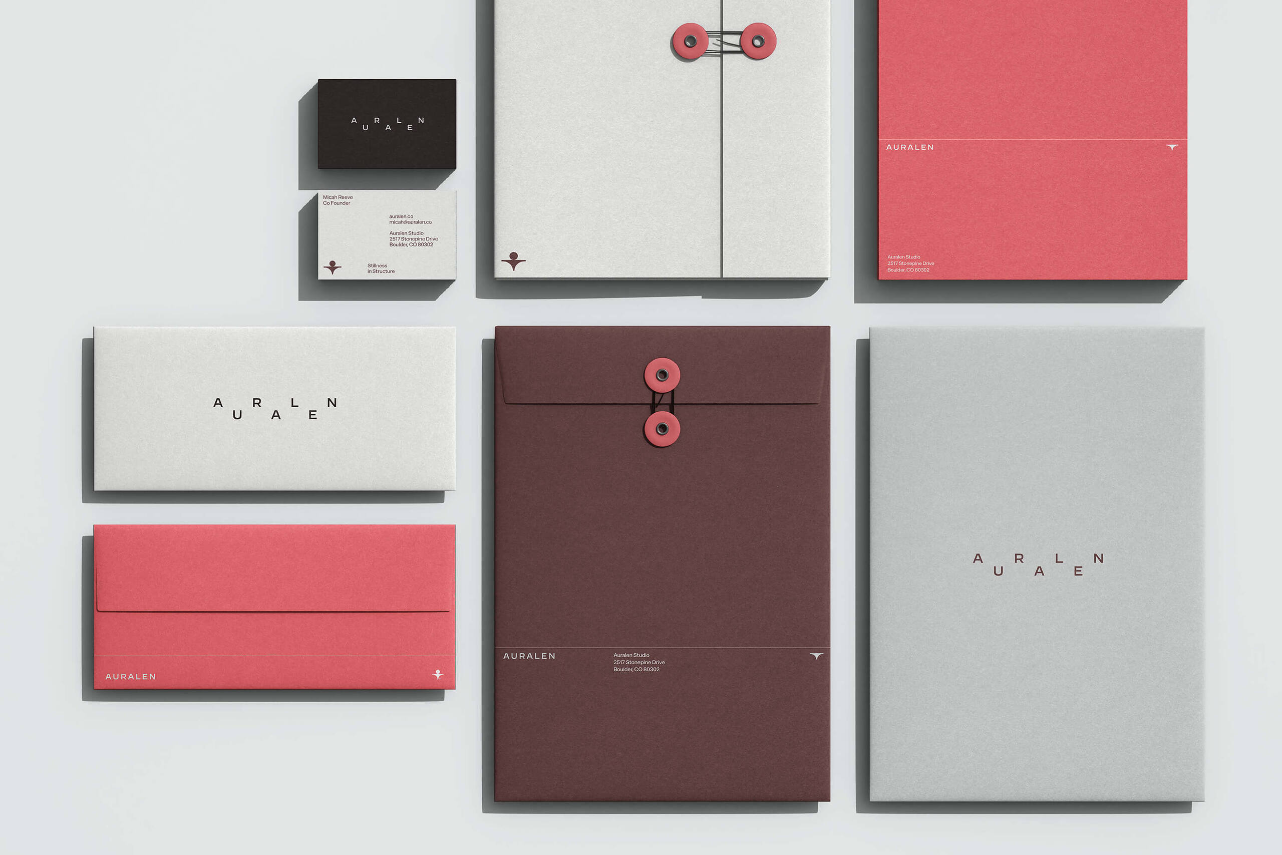
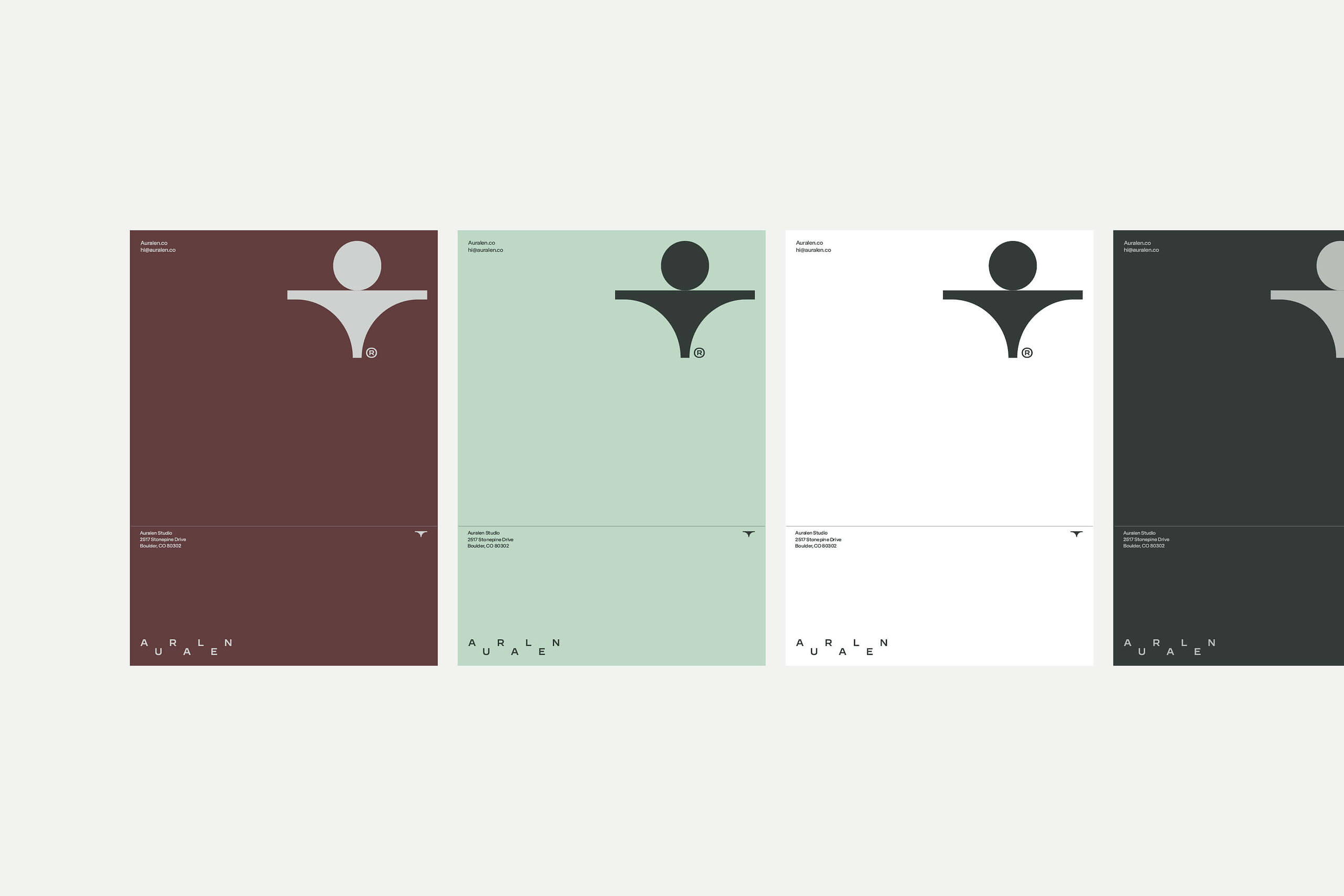
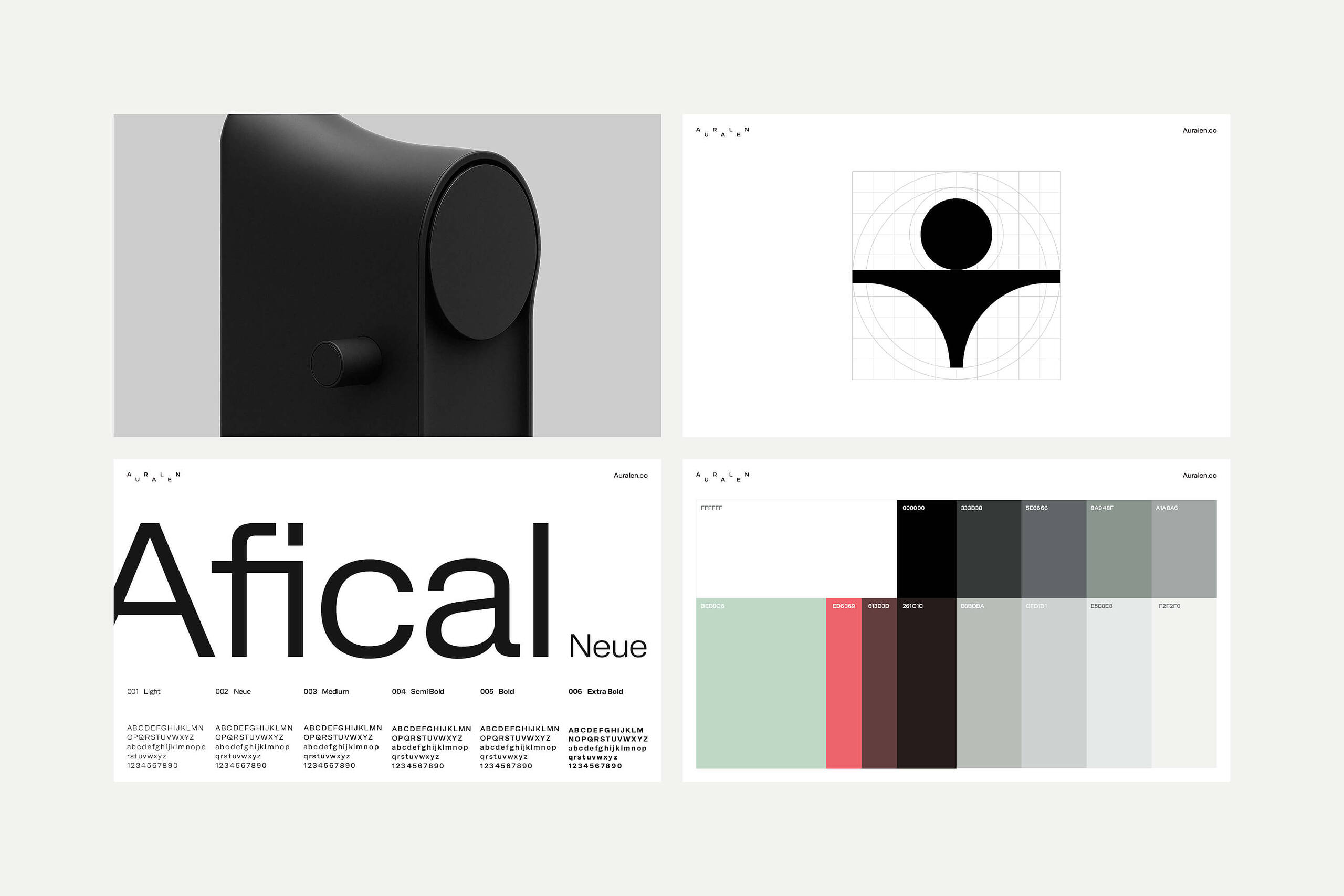
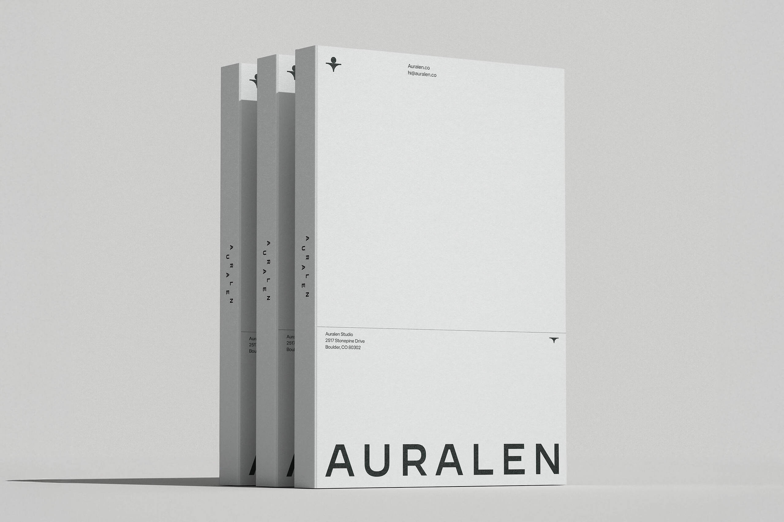
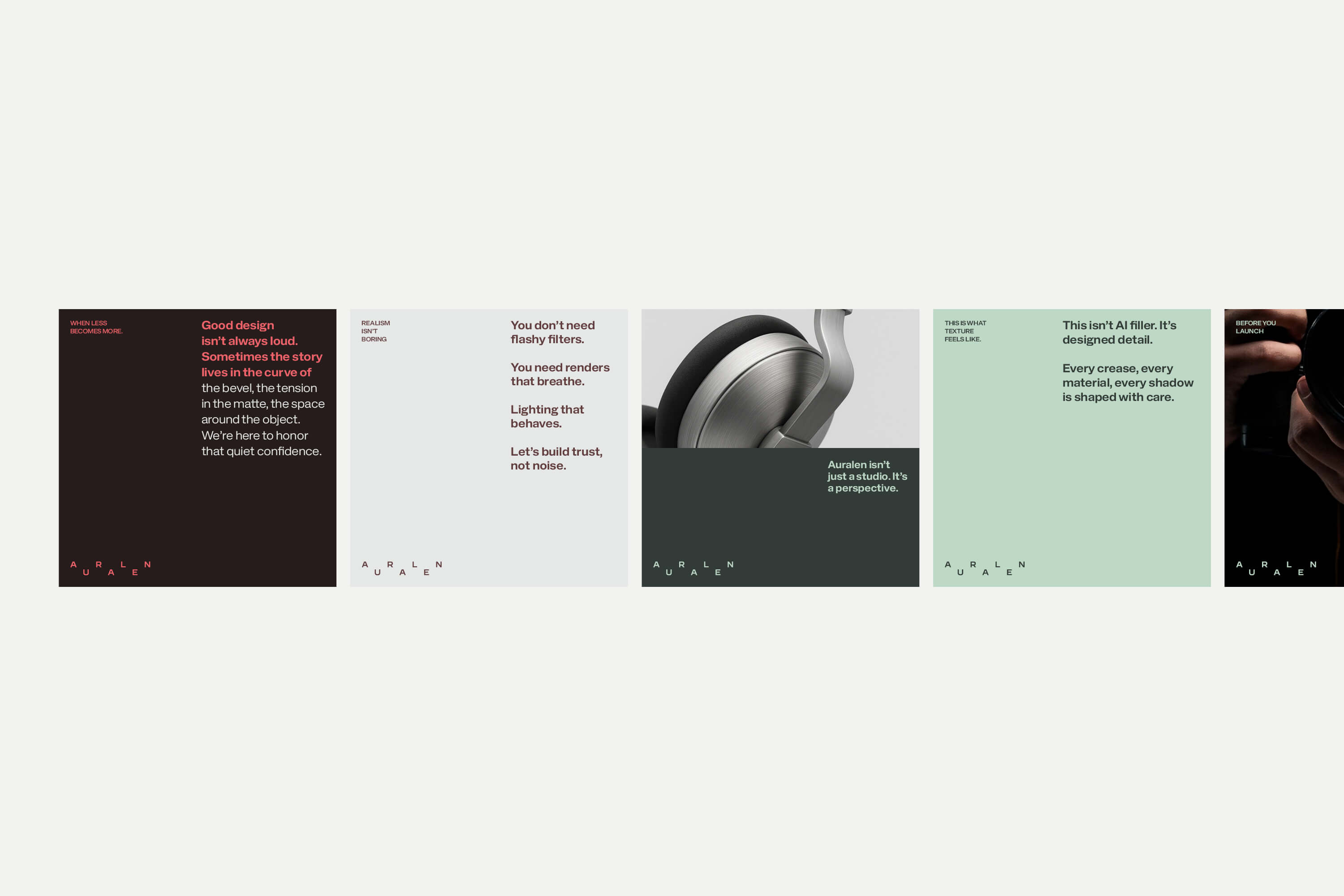
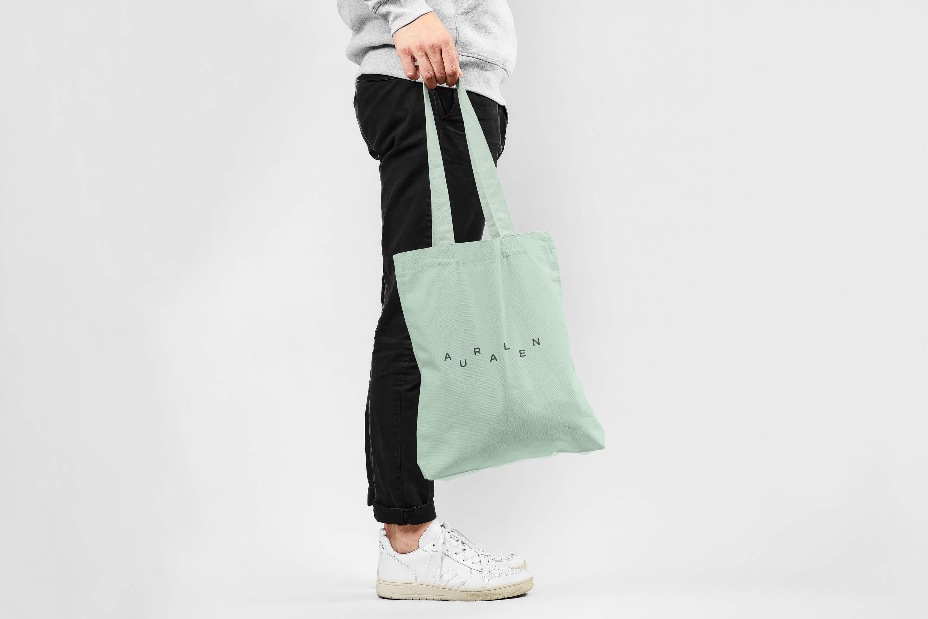
We worked with Auralen to create a full brand identity system that mirrors their ethos. The goal wasn’t to decorate—it was to distill. To bring structure, clarity, and quiet confidence to a brand that already had depth. What we built is minimal by design, but rich in intention.
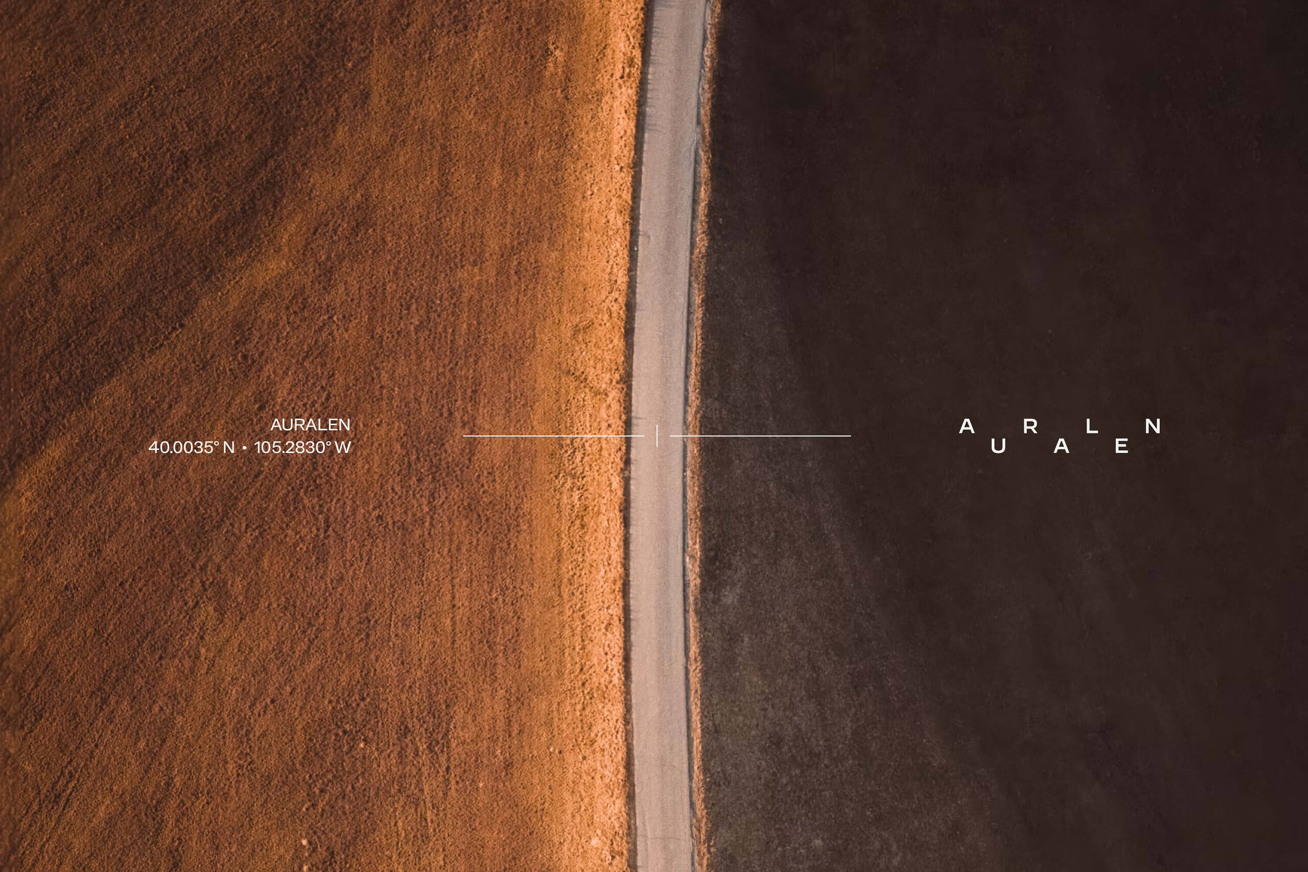
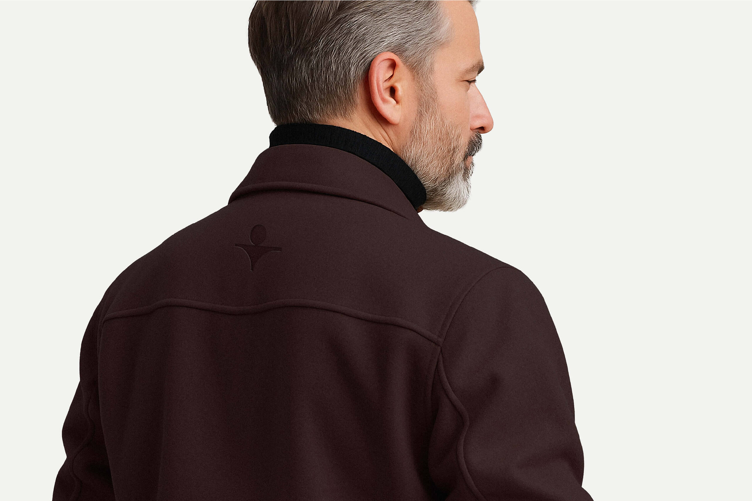
What emerged is a brand identity that doesn’t fight for attention. It holds presence in a different way—calm, clear, and intentional. Auralen doesn’t need to shout. Their work speaks for itself. This brand just helps it speak a little more clearly.