
A Brand That Feels Like a Question—and an Answer
Branding for AI is tricky. Too often, companies fall into tech clichés—cold, hyper-minimalist designs that strip away all personality in the name of looking “futuristic.” Perplexity rejected that entirely. Instead of making the brand feel robotic, Smith & Diction created brand identity that feels human, curious, and open—a brand that’s as much about the questions as it is about the answers.
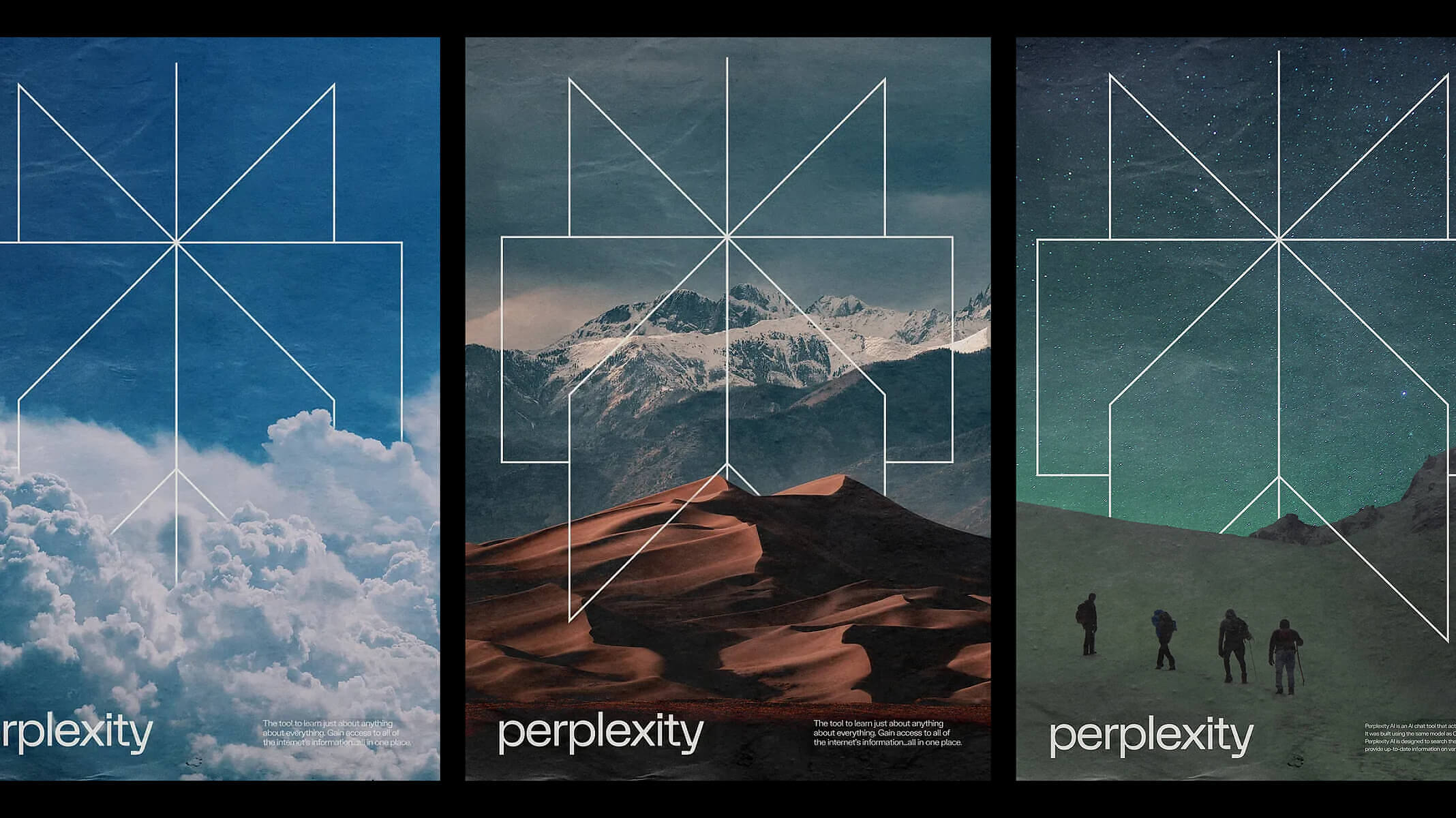
The Logo: A Symbol of Curiosity and Connection
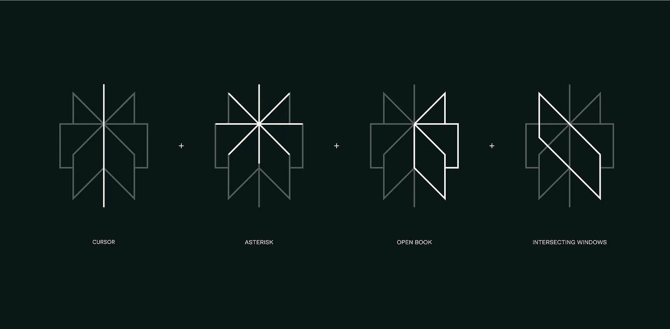
Logos aren’t just marks; they’re ideas in visual form. The Perplexity logo is a brilliant fusion of meaning and simplicity.
At first glance, it looks like a symmetrical emblem—but break it down, and you’ll see the layered thinking behind it. It’s composed of four key elements:
- A cursor → The starting point of a search.
- An asterisk → A symbol of discovery and expansion.
- An open book → Knowledge, learning, and exploration.
- Intersecting windows → A nod to layered perspectives and new ways of seeing information.
This isn’t just a logo—it’s a philosophy distilled into geometry. The logo visually reinforces Perplexity’s mission: to change the way we access knowledge by expanding perspectives and creating connections.
Compare this to the overly simplified marks of many AI brands, and it’s clear why Perplexity stands out. It has depth, story, and purpose.
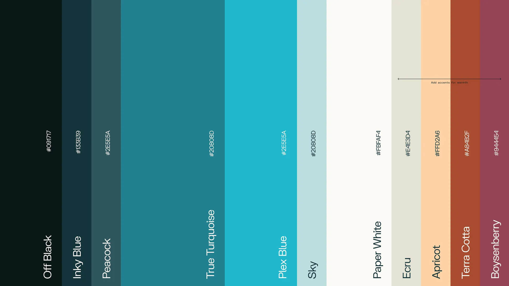
Color Palette: A Departure from Cold AI Branding
Most AI brands lean into dark interfaces, grayscale tones, and sterile blues—colors meant to convey “tech” but often end up feeling cold and uninviting.
Perplexity’s brand identity does the opposite. The brand’s color palette is vibrant yet refined, built around shades of teal, sky blue, and warm earth tones that create a sense of both trust and curiosity.
This isn’t an accident. The palette is designed to feel editorial and modern, pulling inspiration from magazines and traditional media design. It positions Perplexity not just as an AI tool but as a trusted source of knowledge—a space where learning feels natural, not transactional.
This approach aligns with Smith & Diction’s larger philosophy: Branding should be felt, not just seen.
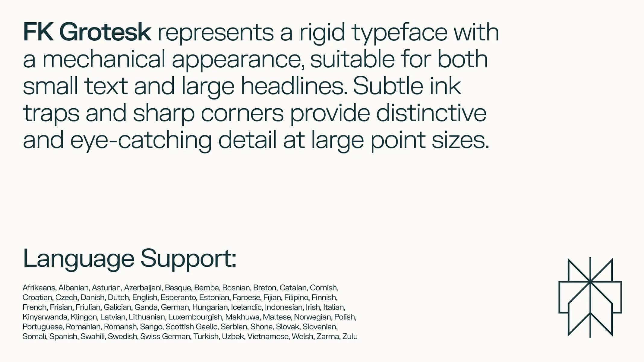
Typography: Where Structure Meets Expression
Type is a brand’s unspoken voice, and Perplexity speaks in a precise but approachable tone. The brand uses FK Grotesk, a typeface with sharp angles and subtle ink traps that give it a slightly mechanical feel without losing warmth. It’s rigid but not cold, structured but still inviting—a perfect metaphor for the brand itself.
Typography is often an overlooked detail in branding, but here, it’s doing a lot of heavy lifting. Perplexity’s type choices help it feel both intellectual and accessible—a rare balance in AI branding.
It’s a lesson in using typography to reinforce brand perception, not just to fill space.
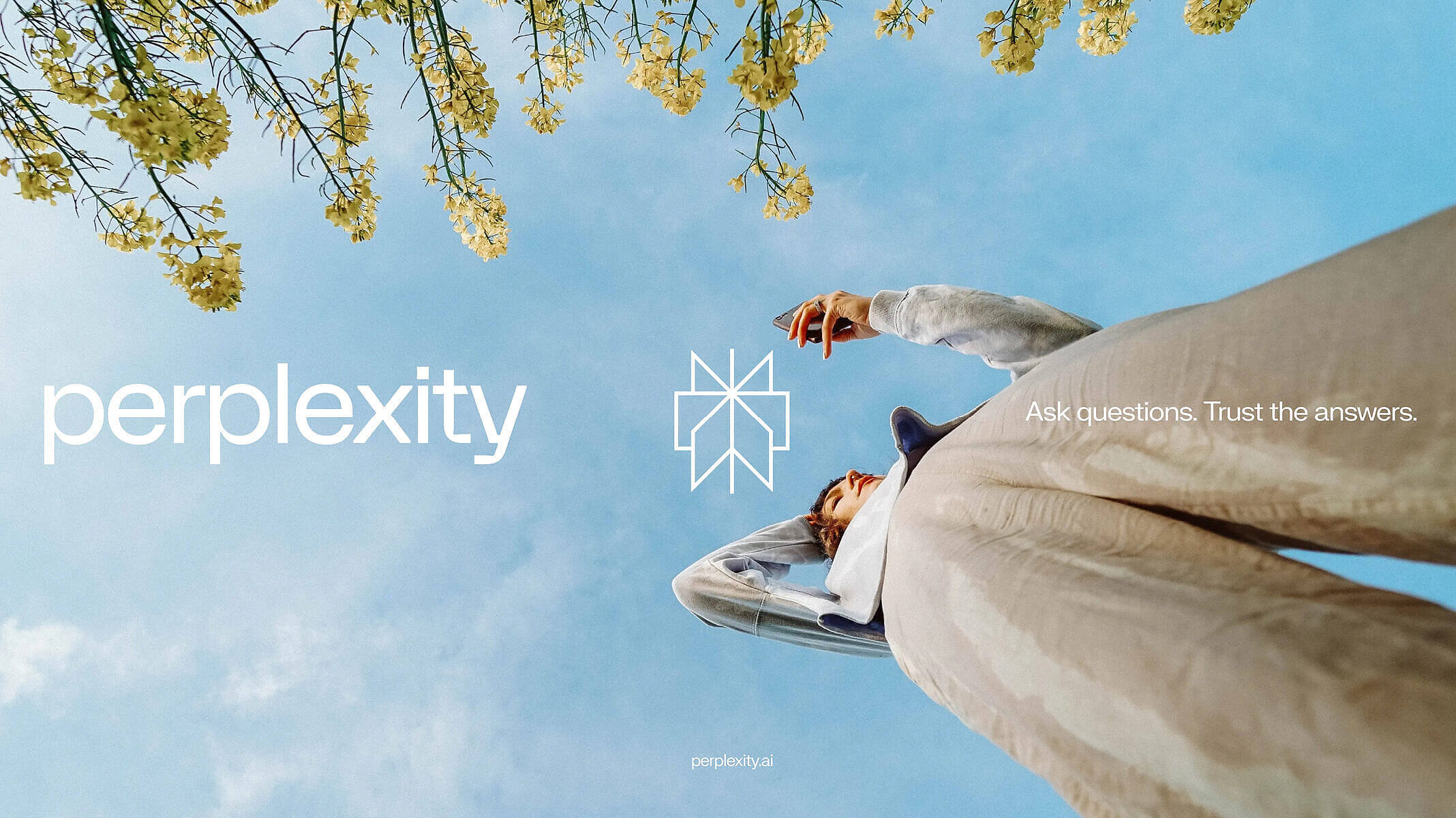
Brand Voice: Clear, Confident, and Human
A brand isn’t just how it looks—it’s how it speaks. Perplexity’s brand voice is minimal, precise, and direct, yet never robotic. There’s a clarity in their messaging that feels effortless but deeply considered.
Look at their tagline:
“Ask questions. Trust the answers.”
It’s not overwritten. It’s not trying too hard. It’s just clean, confident, and exactly what it needs to be.
This approach carries through in their product copy, website, and marketing materials. Every sentence feels intentional—never too much, never too little. If you’re building a brand, this is the gold standard for voice and tone: Say exactly what you need to say. No more, no less.
Why Perplexity’s Brand Identity Works So Well
What Smith & Diction accomplished with Perplexity is rare in AI branding. They built an identity that is:
- Visually distinctive. No generic tech tropes.
- Strategically meaningful. Every design decision serves a purpose.
- Emotionally resonant. It feels human, not just looks good.
Most AI brands fall into one of two traps: they either look too sterile and corporate or too playful and unserious. Perplexity strikes a perfect balance—it’s structured but warm, intelligent but approachable.
This is how branding should be done. Not just aesthetically, but strategically.
Final Thoughts: Brand Like the Best
Perplexity’s brand identity proves that AI branding doesn’t have to feel lifeless. It can be thoughtful, engaging, and full of character—when done right.
If you’re building a brand, take notes:
- Branding isn’t decoration—it’s meaning. Every design choice should have intent.
- A great brand doesn’t just look good—it feels right. Perplexity’s identity is seamless because it aligns with its mission.
- Less is often more. Clarity beats complexity. Always.
If you want a brand that stands out—not just visually, but strategically—this is how you do it. And if you need a partner to build a brand that owns its space, let’s talk.
Start your brand transformation with Numinous