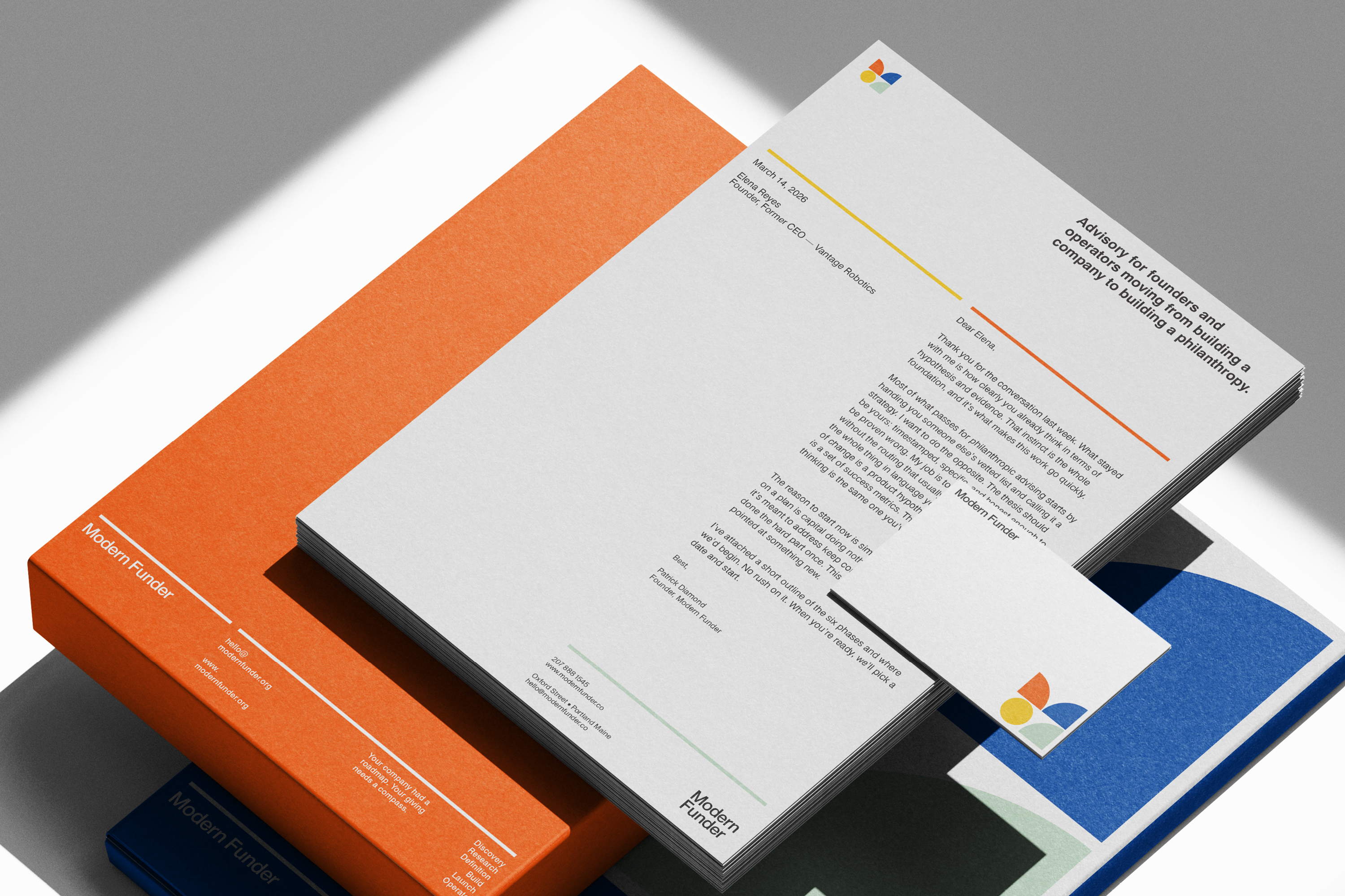
Modern Funder helps operators become deliberate philanthropists. It grew out of four years of running programs for large foundations at Laurel. It takes the practices established funders use and makes them work for philanthropists in the making, without the bureaucracy.
The brief
Patrick came to us with a clear ask: a brand that shows his rigor and frameworks without ever feeling corporate or institutional. His clients are founders and operators moving from running a company to running a philanthropy. They’re used to lean, precise thinking, so the identity had to be too.
Strategy first
We started with discovery, not shapes. How Patrick thinks, who he’s building for, and what the brand needed to say before it needed to look like anything. The visual identity came out of that work, not the other way around. It’s how we build every brand system.
The system
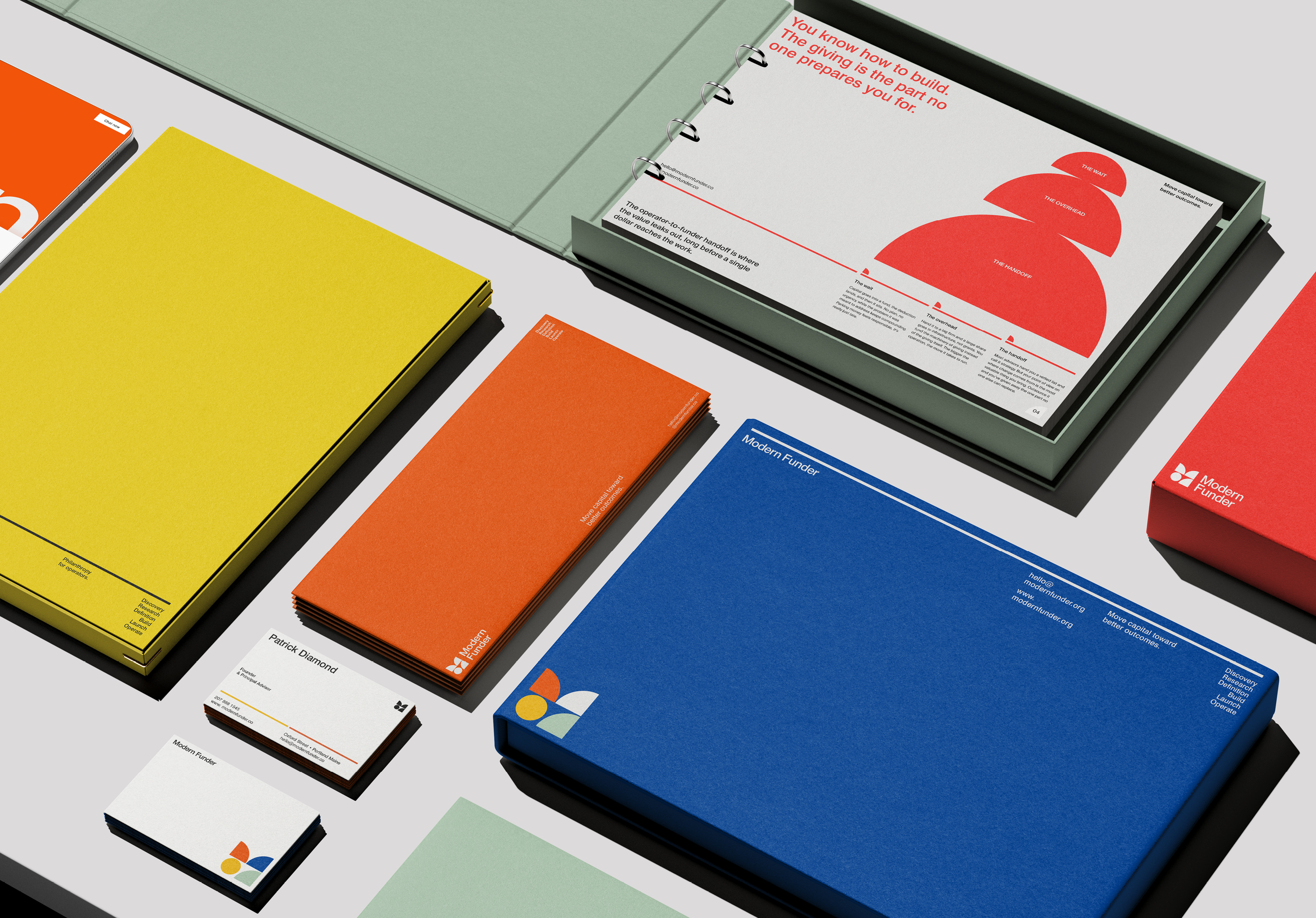
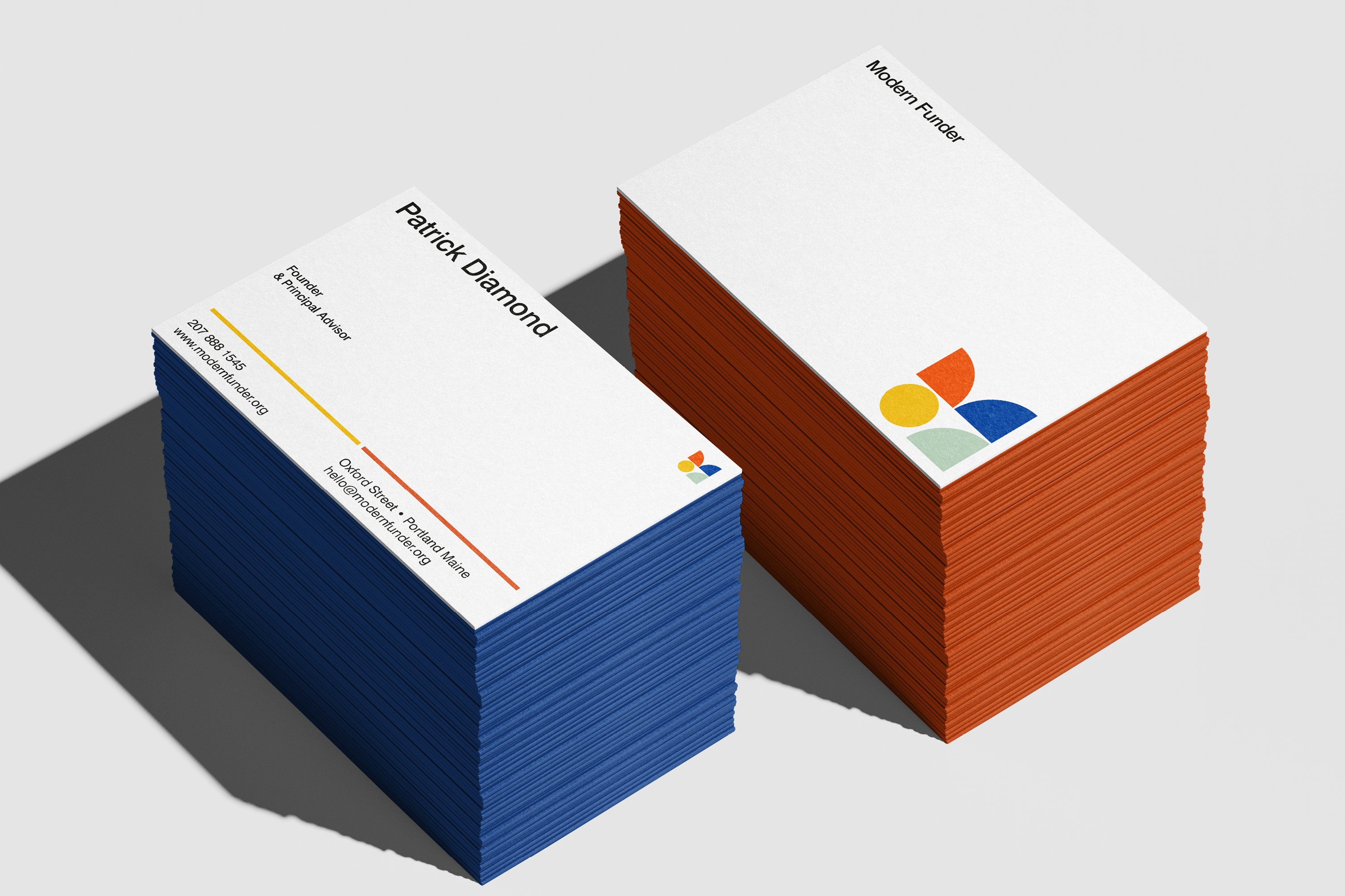
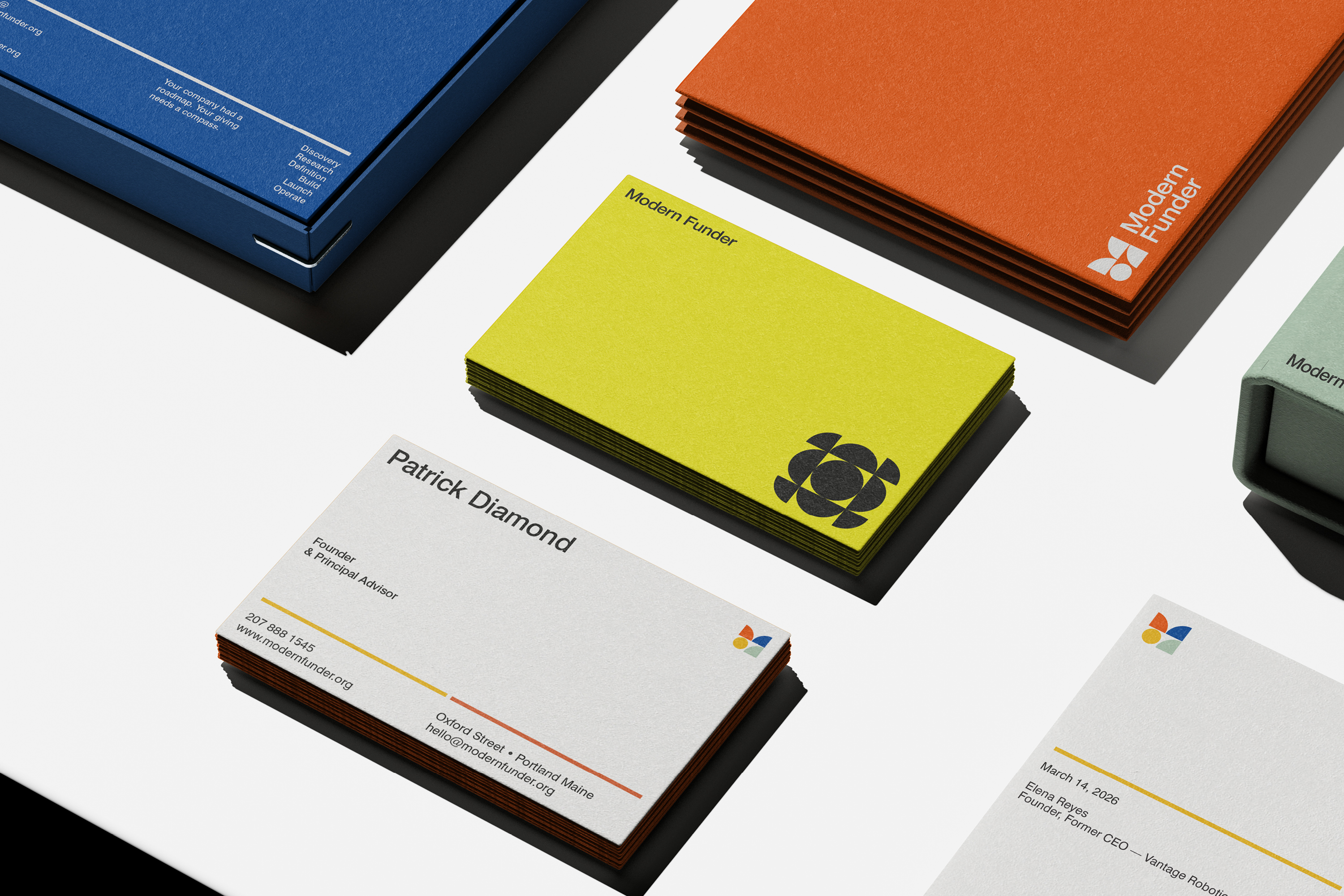
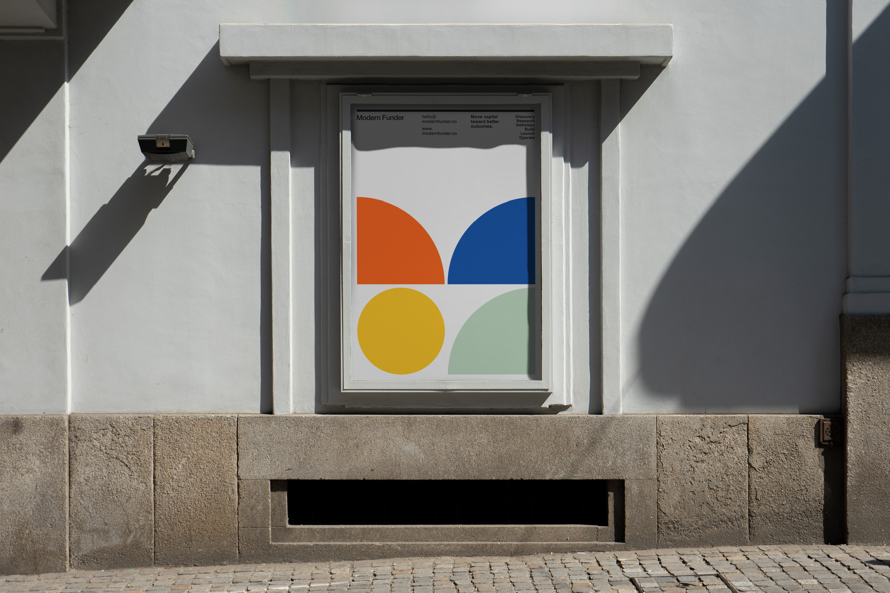
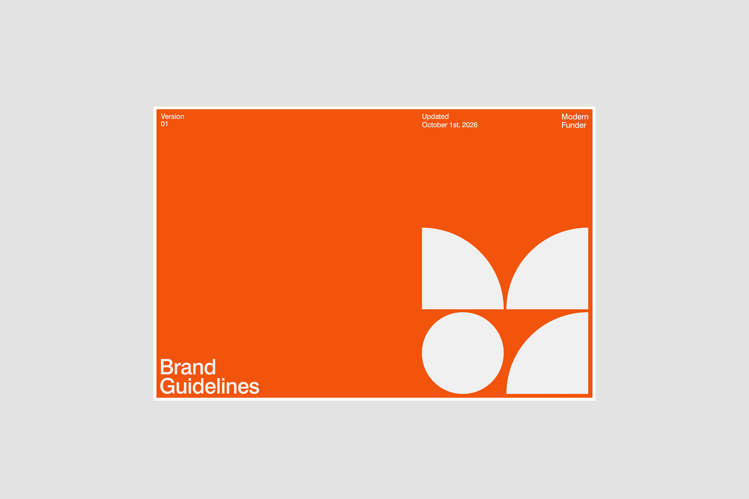
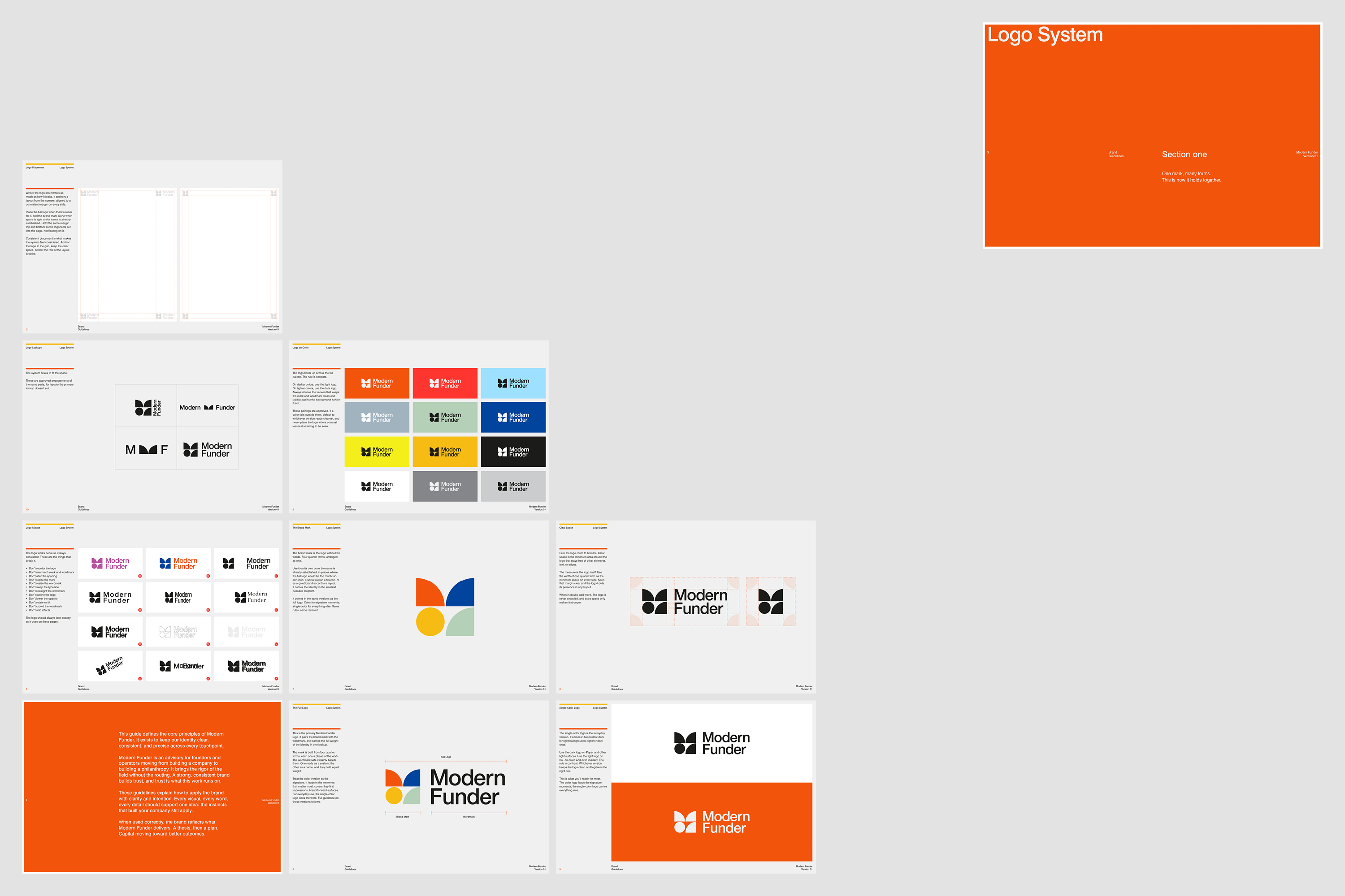
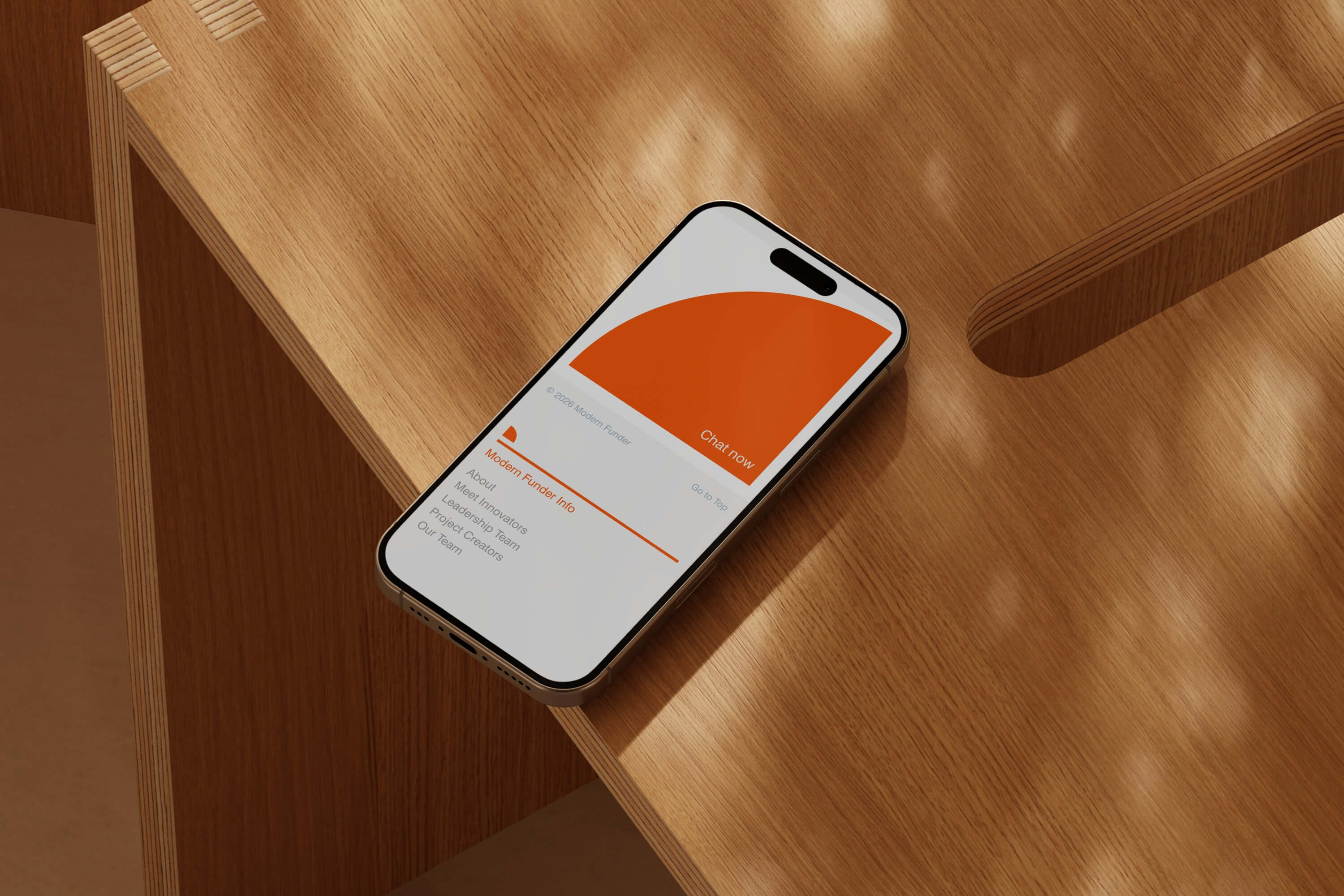
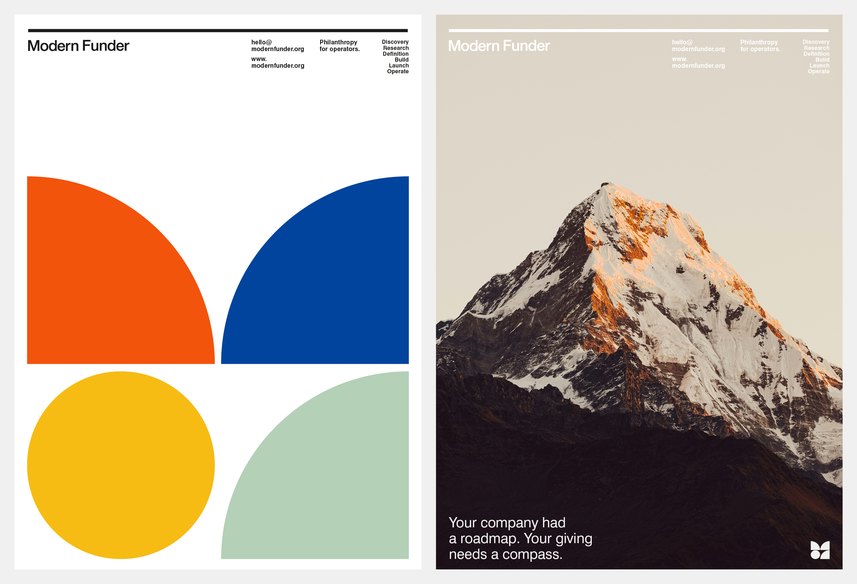
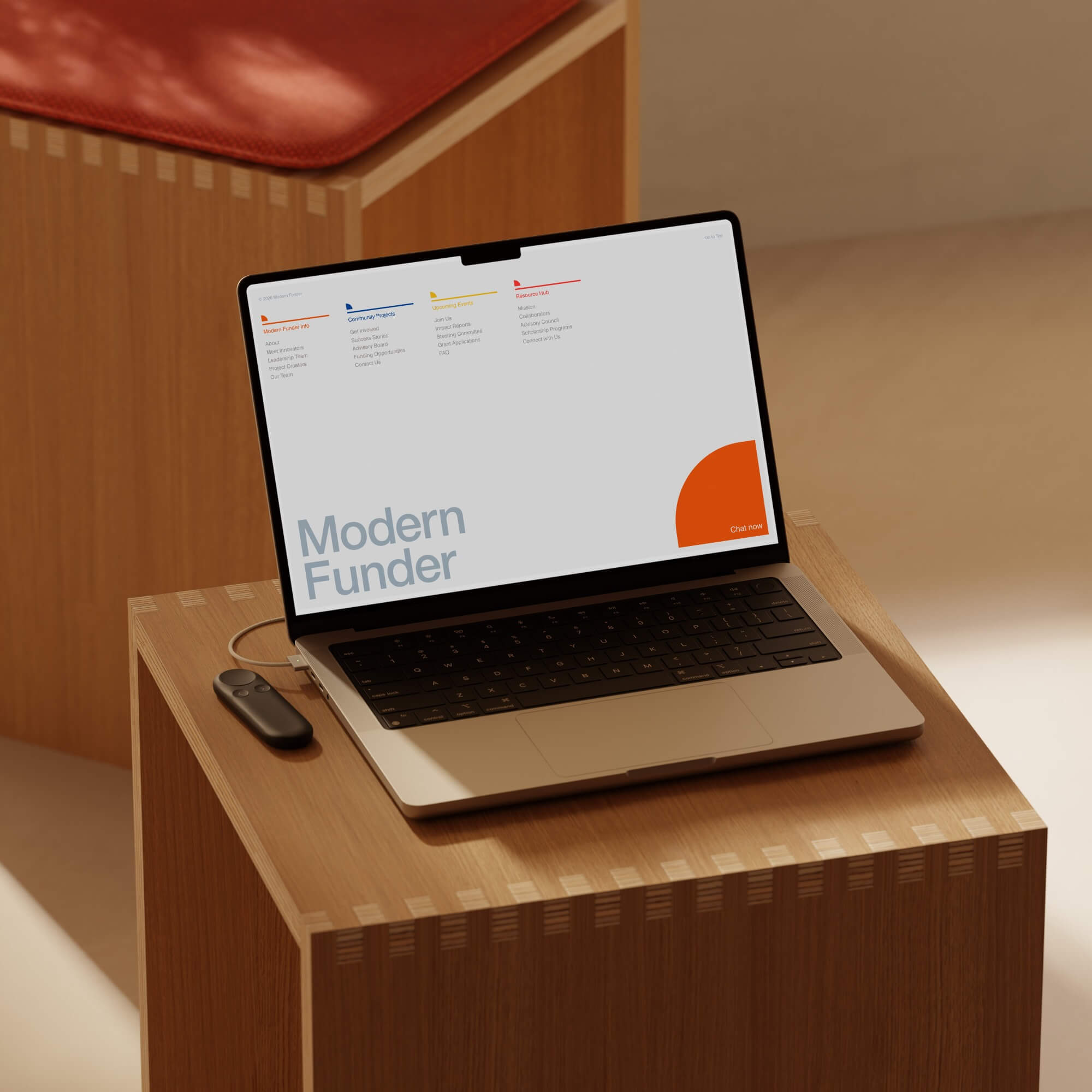
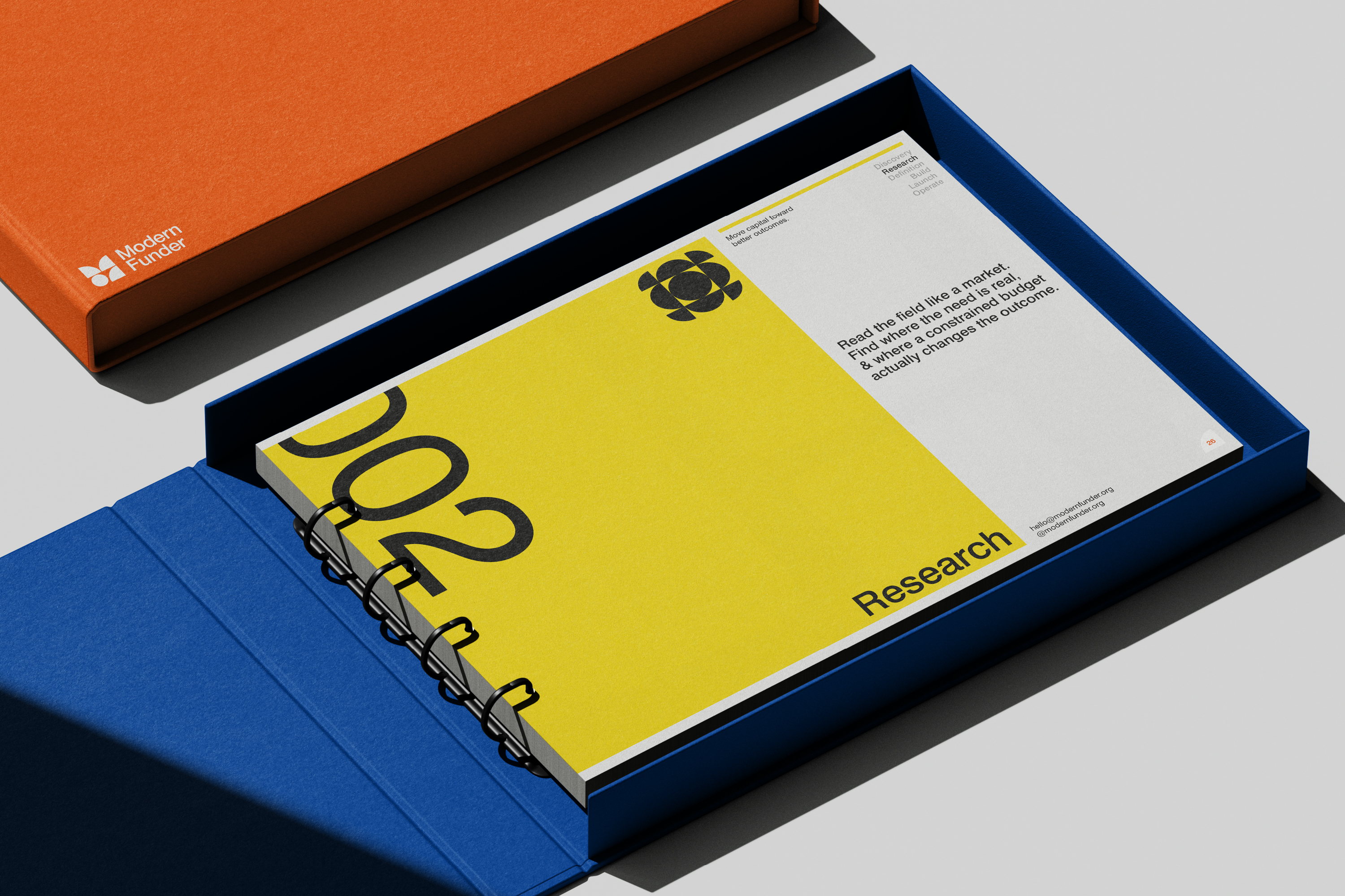
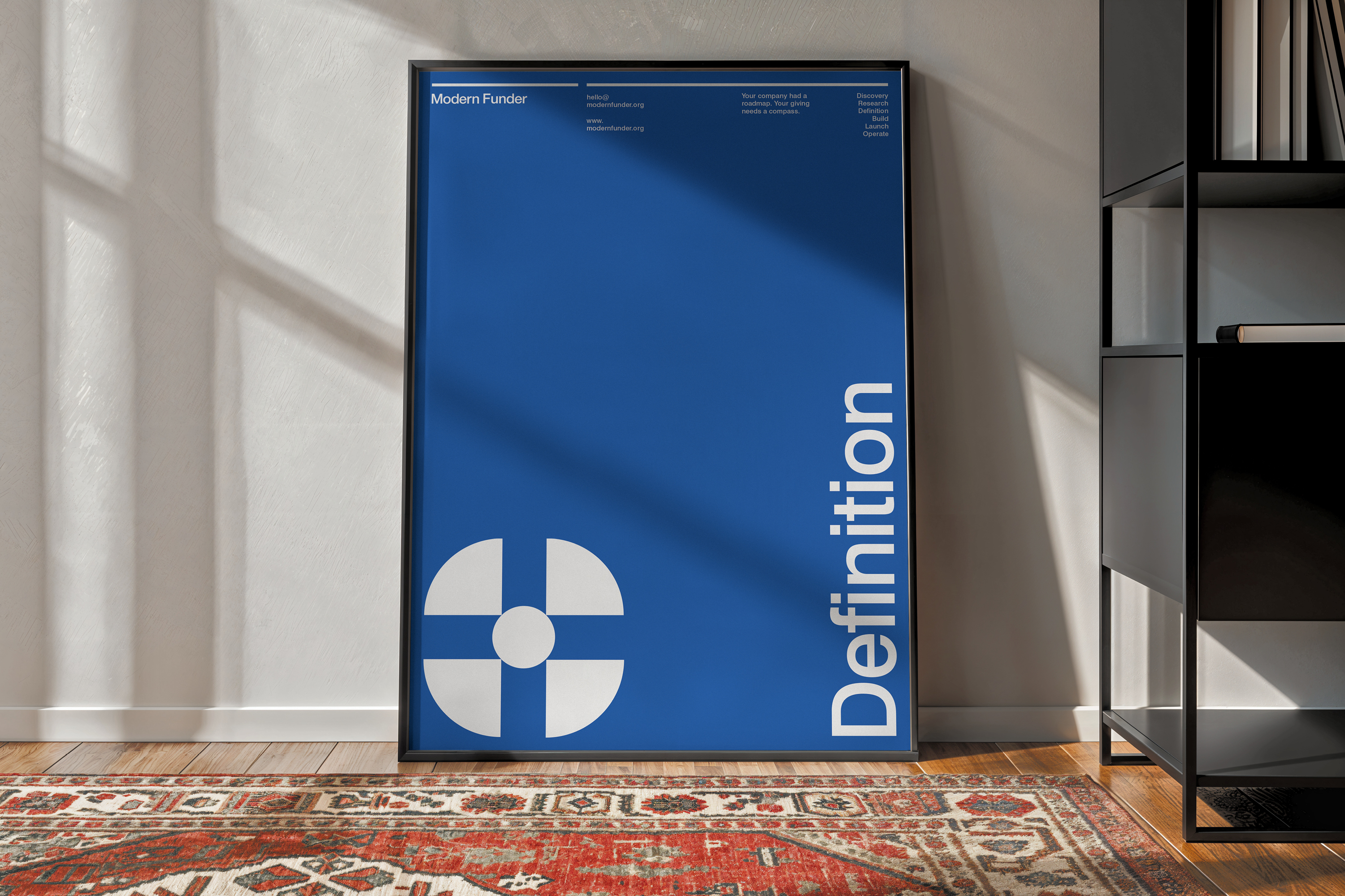
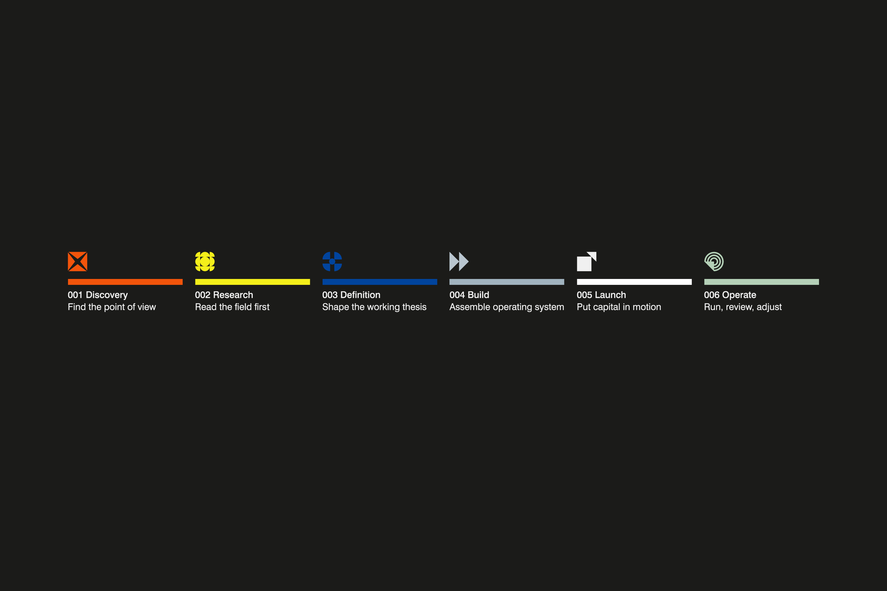
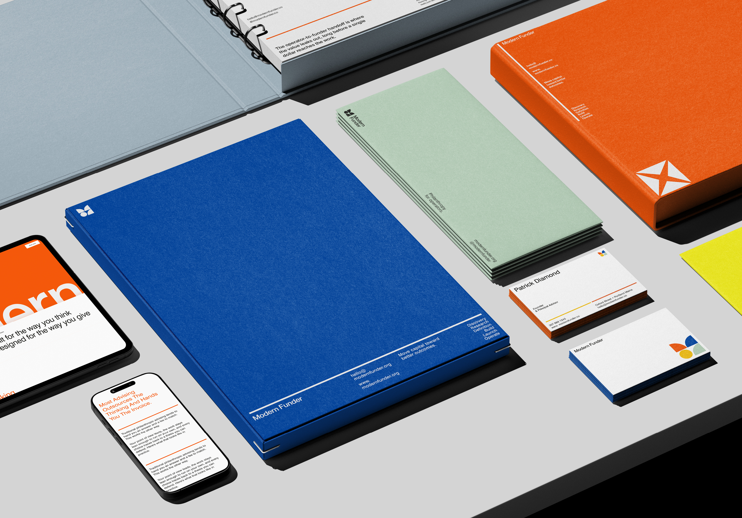
The identity is built around his six-phase process, Discovery through Operate. Each phase has its own color and icon, so the brand works like a map. The logo is made from simple geometric forms, set on a six-column Swiss-modernist grid in Swiss 721. Bars and quarter forms follow strict rules about where they sit and how they combine, so every page reads as part of one system. The same rules carry through the guidelines, the templates, and the website.
Credits
Client: Modern Funder
Brand and visual identity: Numinous Agency
Website design: Artem
Industry: Philanthropy advisory
Scope: Brand identity system, web design