The Best Brands Say "There You Are," Not "Here I Am"
Parker said it in our first real conversation.
He was describing the kind of person ACE Resource Network wanted to be. Not someone who walks into a room and announces here I am. Someone who walks in and says there you are.
I wrote it down and underlined it twice. That one line ended up shaping the whole brand.
Here's the strange part. ACE is brand new. A few months old when we started. But the person at the center of it, Dr. Nadine Burke Harris, is world-renowned. She gave the TED talk on childhood trauma that everyone has seen. She was California's first Surgeon General. People run up to her at conferences like she's a rock star. So we had a paradox to solve. A new organization with no reputation of its own, carried entirely by one famous person, that did not want to be about that one famous person.
Because ACE is not a megaphone. It's a hub. A force multiplier for everyone else doing the work, from Hawaii to Utah to New York. The brand had to lift up the room, not stand in front of it.
That was the real brief. Not "make us look credible." Make us look like we're here for you.
And it came with a second tension, the one that makes this category so hard. ACE lives on rigorous, evidence-based science. It also has to feel warm enough that a parent with no medical background reads it and thinks, they get me. Most brands in this space pick one. They go clinical and cold, or they go soft and lose the authority. ACE needed both at full strength.
Parker had a way of describing the audience that stuck with me. Everyone is driving toward the same North Star, breaking the cycle of childhood trauma. But everyone has their own on-ramp. For some states that on-ramp is colonial history. For others it's a specific kind of harm done to kids. Same highway, different entrances. The brand could not force one door. It had to open several and make all of them feel like the right one.
So we did what we always do. We didn't start with the logo. We started with the world. That's our process, and it's where this project earned its keep early.
Somewhere in discovery I had quietly marked "North Star" in my notes as a direction worth exploring. A little later Parker said it out loud, unprompted, as the thing the whole movement is pointed at. We arrived at the same place from two different chairs. That's the World Building framework doing its job. The mark wasn't something we imposed on ACE. It surfaced out of who they already were.
From there the decisions got easier, because we knew what the world felt like.
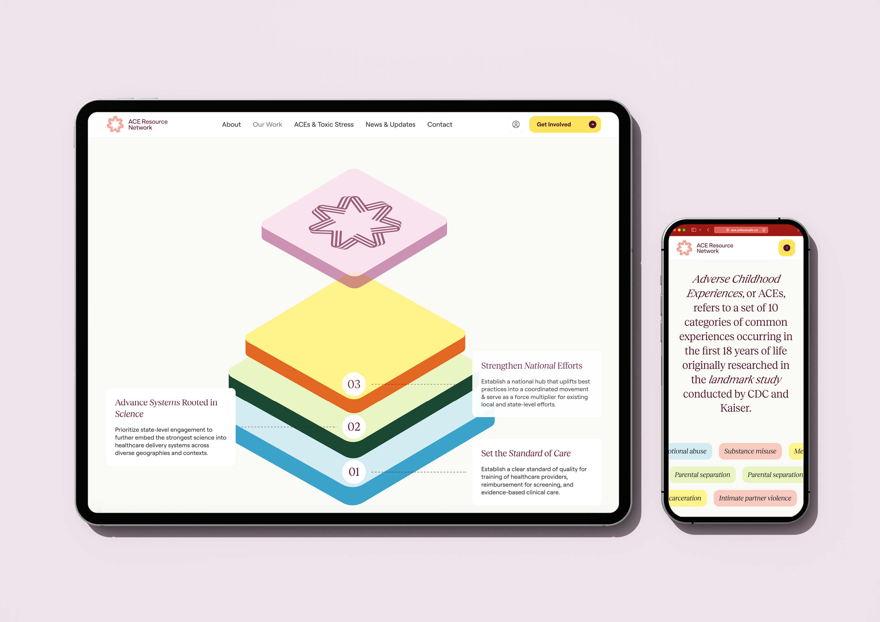
When I put eight visual directions in front of the team, they killed half of them on sight. No to minimalist. No to monochromatic. No to industrial. All of it read as colder than what they wanted to be. What they landed on was bold and colorful. And the reason Parker gave was perfect: "because there's people." That was the whole brand in two words. Not charts. People.
The name fought us a little, in a good way. ACE Resource Network is a mouthful. The obvious move is to crunch it down to initials. Parker wouldn't have it, and he was right. Three letters stuck together mean nothing. They're not who you are. They're a resource and they're a network, so the name stays whole. We built the system to carry the full name and still feel light.
Then we built the rest of it. Not a logo. A system.
This is the difference that matters, and ACE is the clearest case I've made for it. The brand had to work in other people's hands. So we built the full kit. Brand guidelines, sure, but also a report system with master layouts, fact sheets, issue briefs, a social library, video templates, event signage, and co-branded templates so a state organization could put its own name next to ACE's and still look like one family. The whole point was that ACE could hand a partner in New York or Hawaii a set of tools and that partner would feel featured, not branded over. There you are, made literal.
A logo couldn't do that. A system could.
We didn't build it alone, either. We handled everything brand-side and partnered with Uniko on the web build, so the identity we created and the site it lived on stayed one seamless thing instead of two teams pulling in different directions.
When it launched, the thing the team said back to us was the thing we'd been chasing the whole time. They told us they didn't want to look like everyone else out there, and they didn't. The brand was theirs. Unique to them.
Which brings it back to where it started. The best brands in this kind of work don't show up to be admired. They show up to make room. They walk into the field, point at everyone already doing the work, and say there you are.
That's the brand we built. And it's the kind of brand we'll always want to build.