Not every concept we propose to a client gets chosen. This was one of ours, and we still think it deserves to see daylight.
This one was a concept for a Chicago-based private equity client who ended up going a different direction. The system's complete and it's for sale.
The thesis behind Aperture Capital: hold companies for decades, use leverage conservatively, keep the operators in place. It's a patient, contrarian approach in a category that usually rewards the opposite, and that's what the identity had to carry.
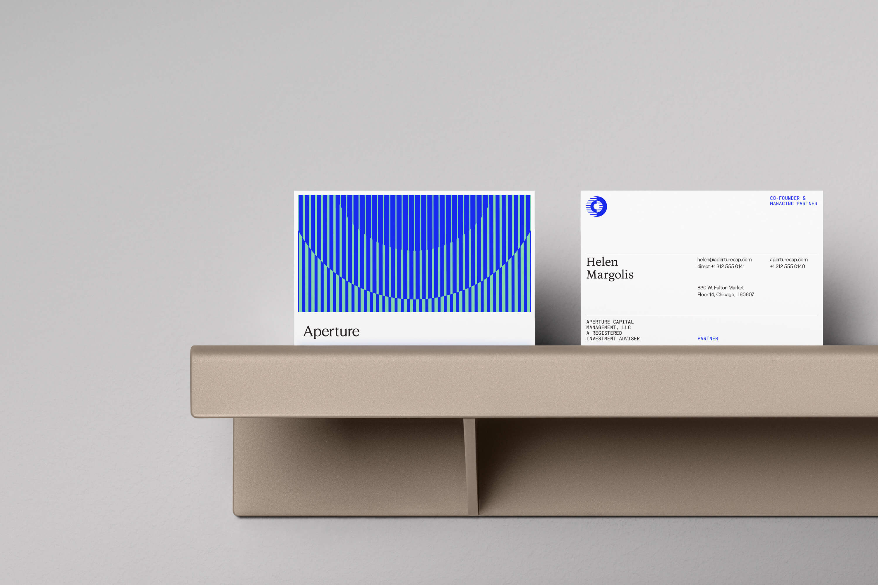
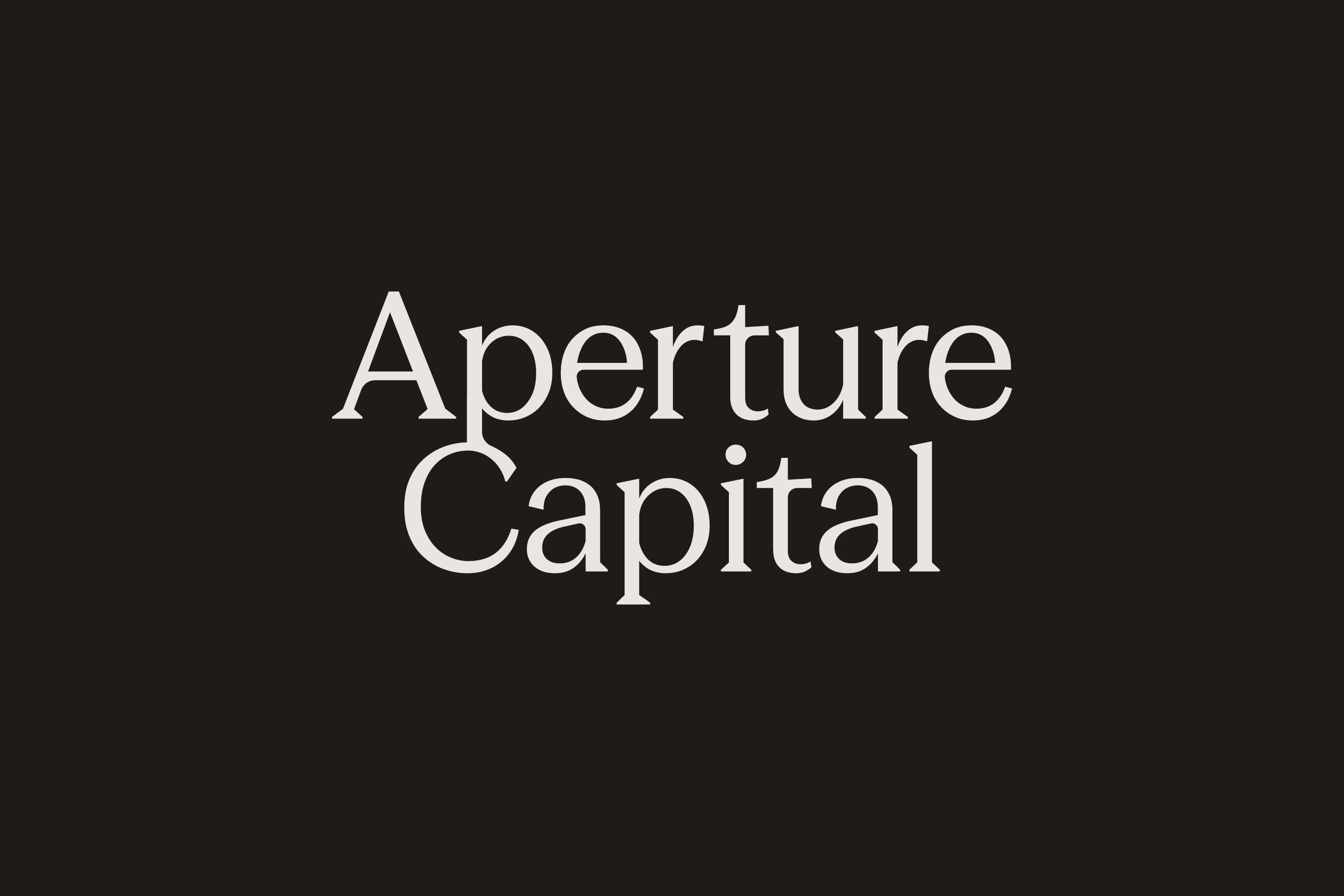
We built the full system. Positioning, mark, typography, color, voice and tagline, stationery, presentation templates, signage, and a publication system for annual letters and quarterly briefings.
The mark carries the thinking. Half striated, half solid: an aperture, and a thesis. Clarity is partial. Conviction is total. The rest follows that logic, editorial type, documentary photography, and a palette built around warm cream, deep ink, and one high-conviction blue.
Like what you see? This identity is available for purchase. Get in touch.